Client: https://doctorcareanywhere.com/
Services:
- Product design
- UX and UI design
- Interaction design
- Tone of voice
- QA
- Brand identity
- Product management
- Animation
- Film production
- Motion graphics
UX, UI, prototyping, tone of voice, QA, logo... the works. Helped lead the redesign of a doctor-founded and clinically-led digital health service from the ground up for web, iOS and Android. Now helping to shape its evolution, process and the future of the design team.
You can watch a short video about how it works here.
Introduction
My role at Doctor Care Anywhere began as a product designer, to expand the design teams knowledge and ability to improve, experiment, evolve and to progress as a product design team. I quickly began to understand the existing issues with the design team, processes setup and how we could improve this...

Onboarding!
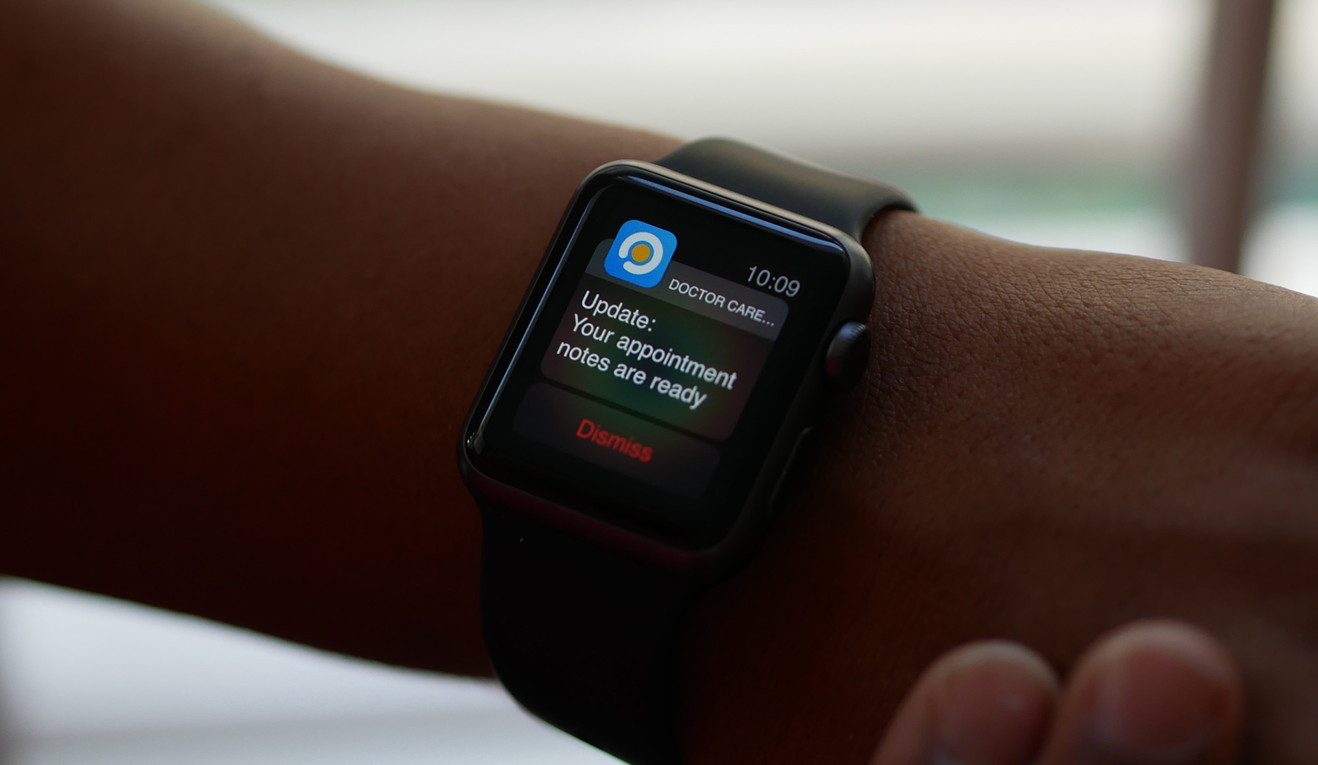
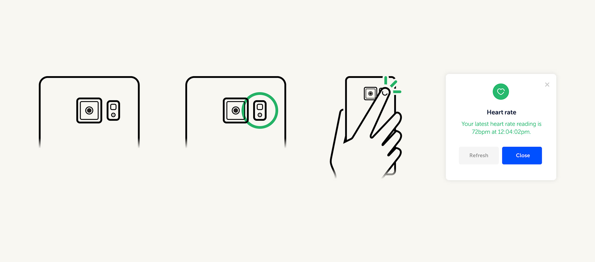
Notification copy and Apple Health integrations
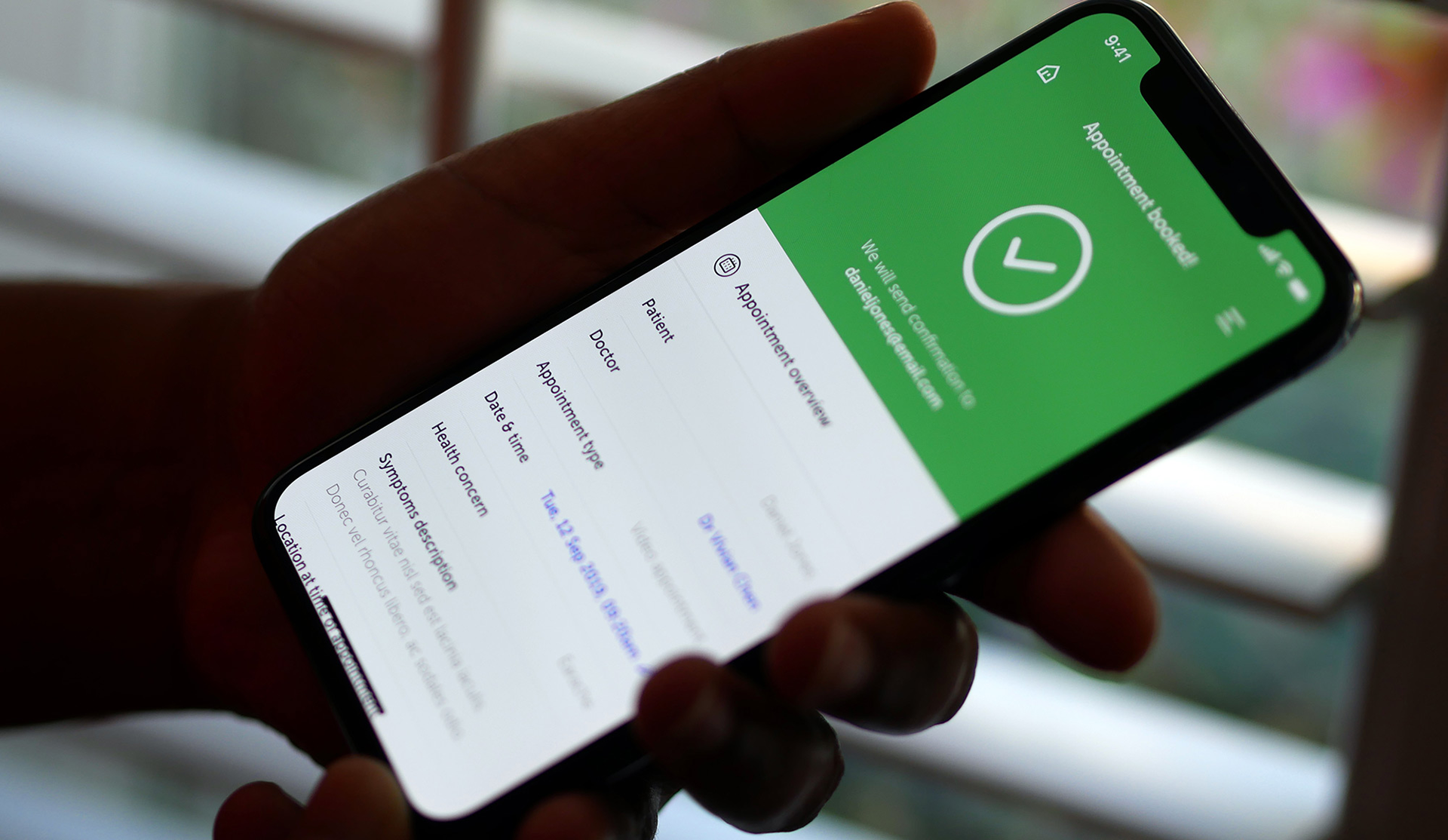
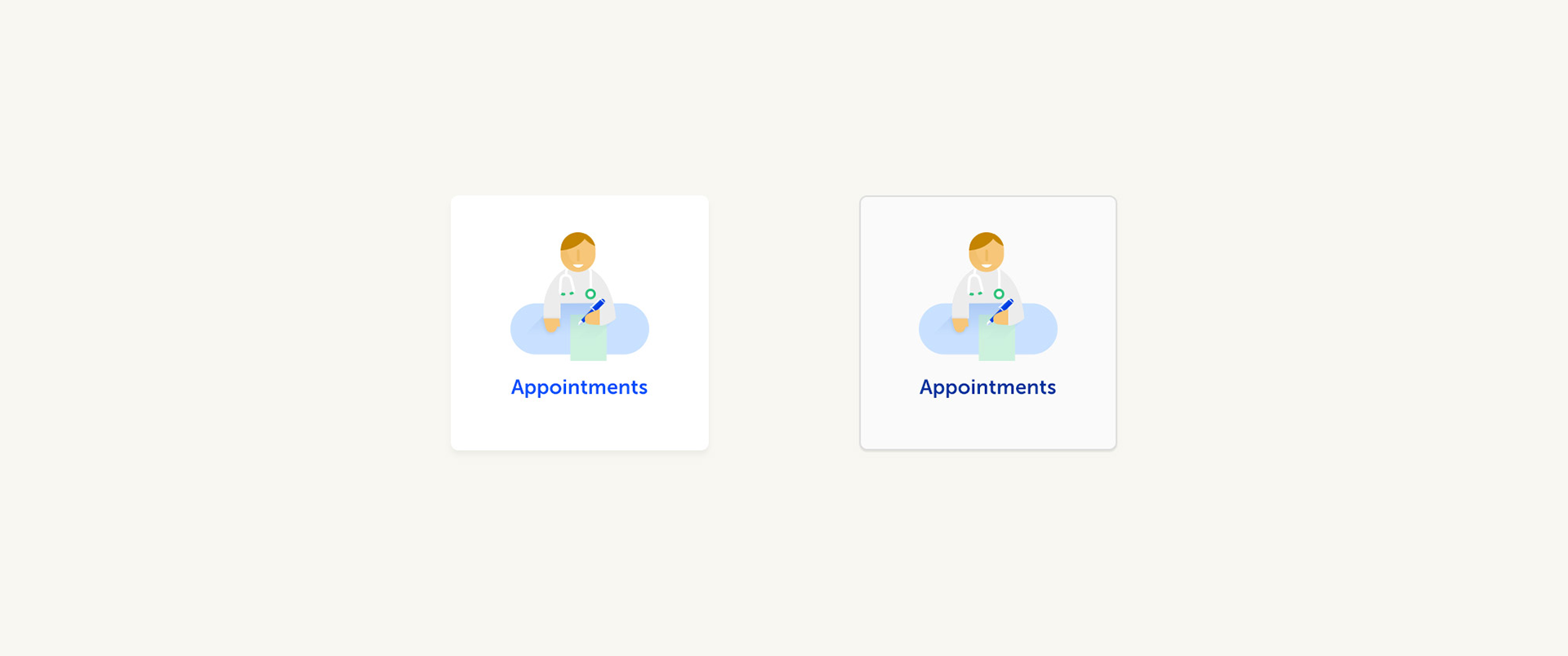
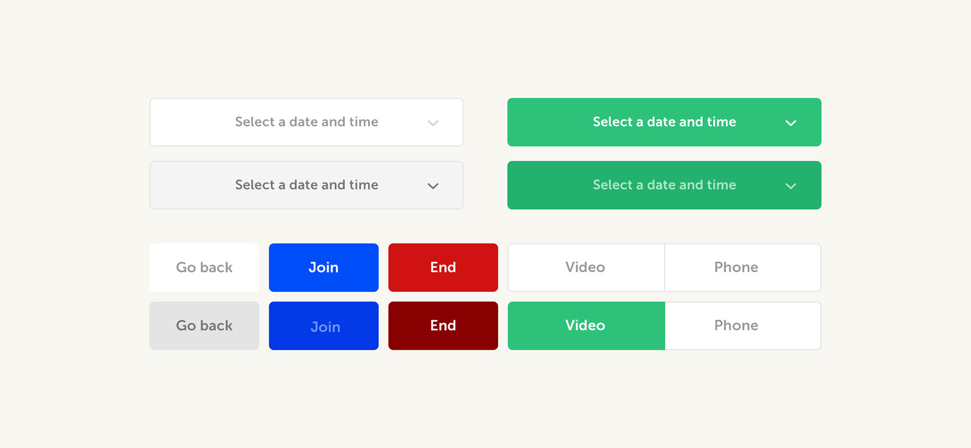
Appointment booking made simple 🔥
Strategy and The Problems We Face
The problem that digital healthcare and virtual consultations face with both users and patients is a 3 pronged issue. Trust, reliability and simplicity.
Patients need to be able to understand their health concerns simply, with easy access to doctors and to be able to get the best and most appropriate advice, response and result as possible.
My general aim as a designer in this role is to advocate for good looking simple designs that allow users to improve their lives.
Research and understanding our users
There is a broad width of users that we face. Getting to understand a user in this area of work is very difficult as you face a lot of clinical safety risks exposing patient data.
We generally have 2 sets of users that we tend to encounter, the "dormant user" 🌋 and the "vulnerable user". 🤒
The Dormant User 🌋
The "dormant user" will see that they have access to the product and tend to be proactive in setting themselves up before they get ill. For this user, we'll need to make the product obvious to someone who tends to leave the platform sat in a "ready to book" state. Giving them precautions and insight into how best to use their account, speaking to doctors and preparing for the worst is very important for this user.
Having the user be able to understand fully how to take advantage of an appointment after potentially not using the product for months.
Something we are tackling in our booking redesign work!
The Vulnerable User 🤒
The "vulnerable user" will be using the product to book an appointment as they are will be ill, believing they are ill or wanting advice and insight from a doctor. For this user, the sign up journey needs to be frictionless and to able to book an appointment within 20 minutes of signing up to the service. For this, we'll need to get them to verification and onboarding in that time and to get their details recognised. Then getting them to book an appointment on top of the issues the dormant user faces!
Creating a frictionless sign up journey is even more difficult as the user won't have their access directly through us, usually through an activation code. Requiring them to know it in advance...
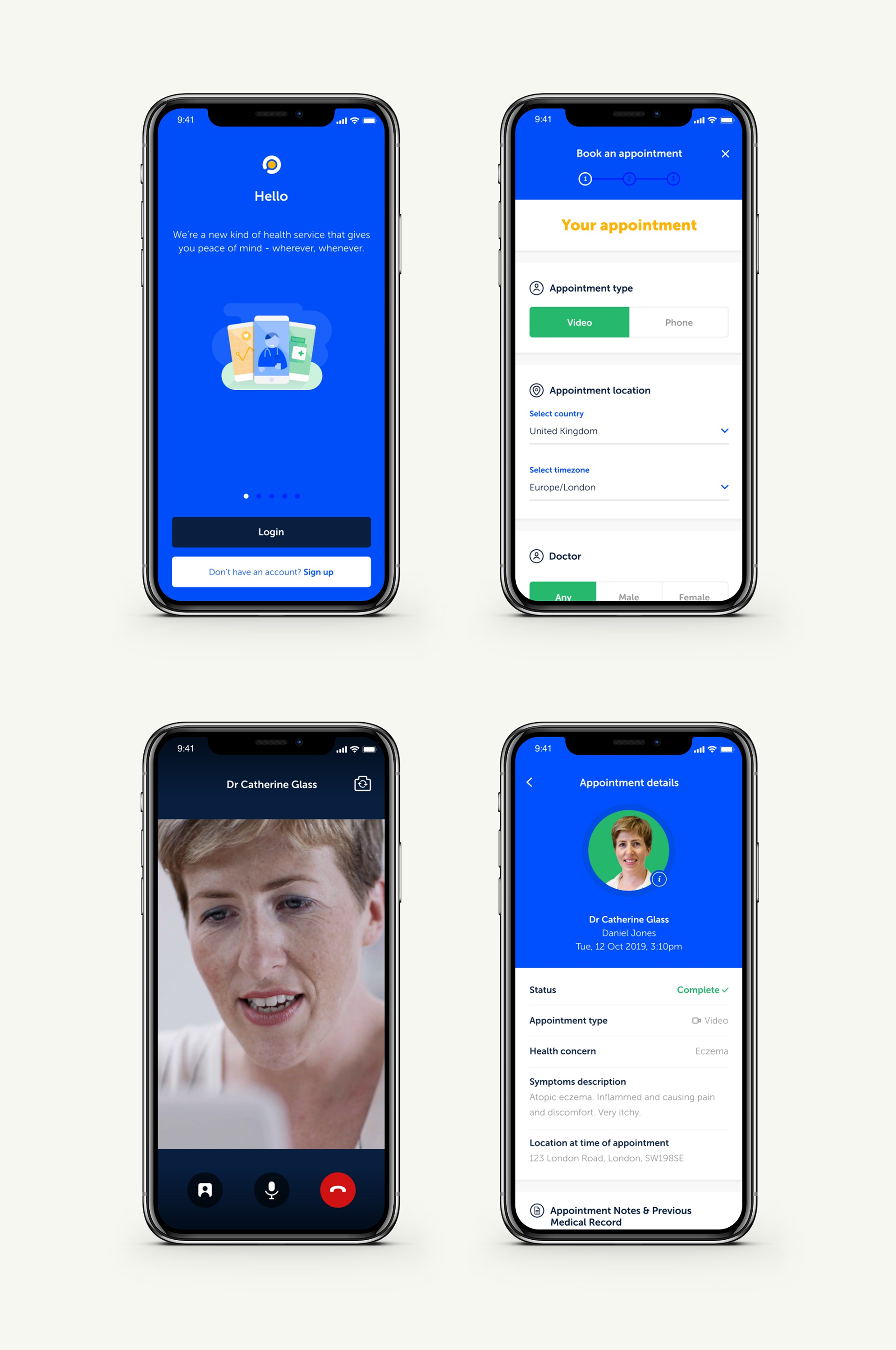
Response and solution
When it comes to tackling an issue, we work in this process and flow:
Discovery (Understand) → Discovery (Ideate) → Discovery (Validate) → Delivery (Ready to build) → Delivery (Build in progress) → Delivery (Ready to release) → Celebrate 🎉
The design team tend to lead the fight within the discovery phase with the aid of PMs within this space. I'll be talking through a recent example in this section, the "signing up without an activation code" work mentioned above.
Understanding the problems
At this point of the process we'll get together with stakeholders to see who will benefit from this, will suffer without this and what this will add to the product offering. We'll do some problem framing around this section and come out with a result using the WHO, WHAT, WHEN, WHY layout.
Who: Patients
What: Need to know their activation code
When: Attempting to sign up, having recently become entitled to the service by joining a new company or their current company joins DCA
Why: So that they can see a doctor quickly and so that DCA can more quickly reach our north star metric
Around this point we'll get together with stakeholders again to discuss what success from this will look like, let's say improve people getting into the signup flow by 10%, just as I don't want to trade secrets! Now we're entering towards some experimentation stage and one of my favourites as it really lets us us stretch our creative legs.
Ideating and wireframes
As we enter the ideate phase, we'll be reviewing the data that has been pulled around the issue to work with analytics if we can recognise areas that we can improve on.
Here we utilise some activities and tactics used in the GV design sprints, mostly used is a combination of Crazy 8s and solution sketches to drill deep into the problem!
The process that we would be finding solutions and ideas for would be: Users can input some recognisable information within our signup process to "retrieve" their account
Running a workshop with a smaller team tends to be quite difficult especially working with people from analytics and project management as they tend to be less visual than designers which tends to bring some friction and embarrassment as people expect an amazing high fidelity design! A challenge but a welcome one!
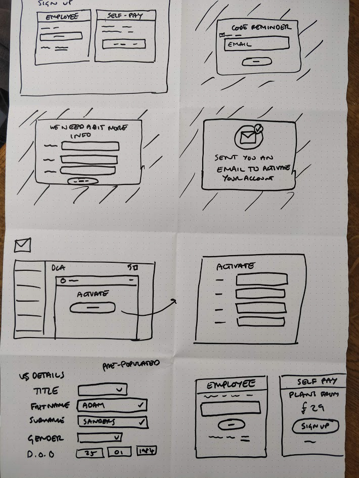
Crazy 8s!

Crazy 8s!
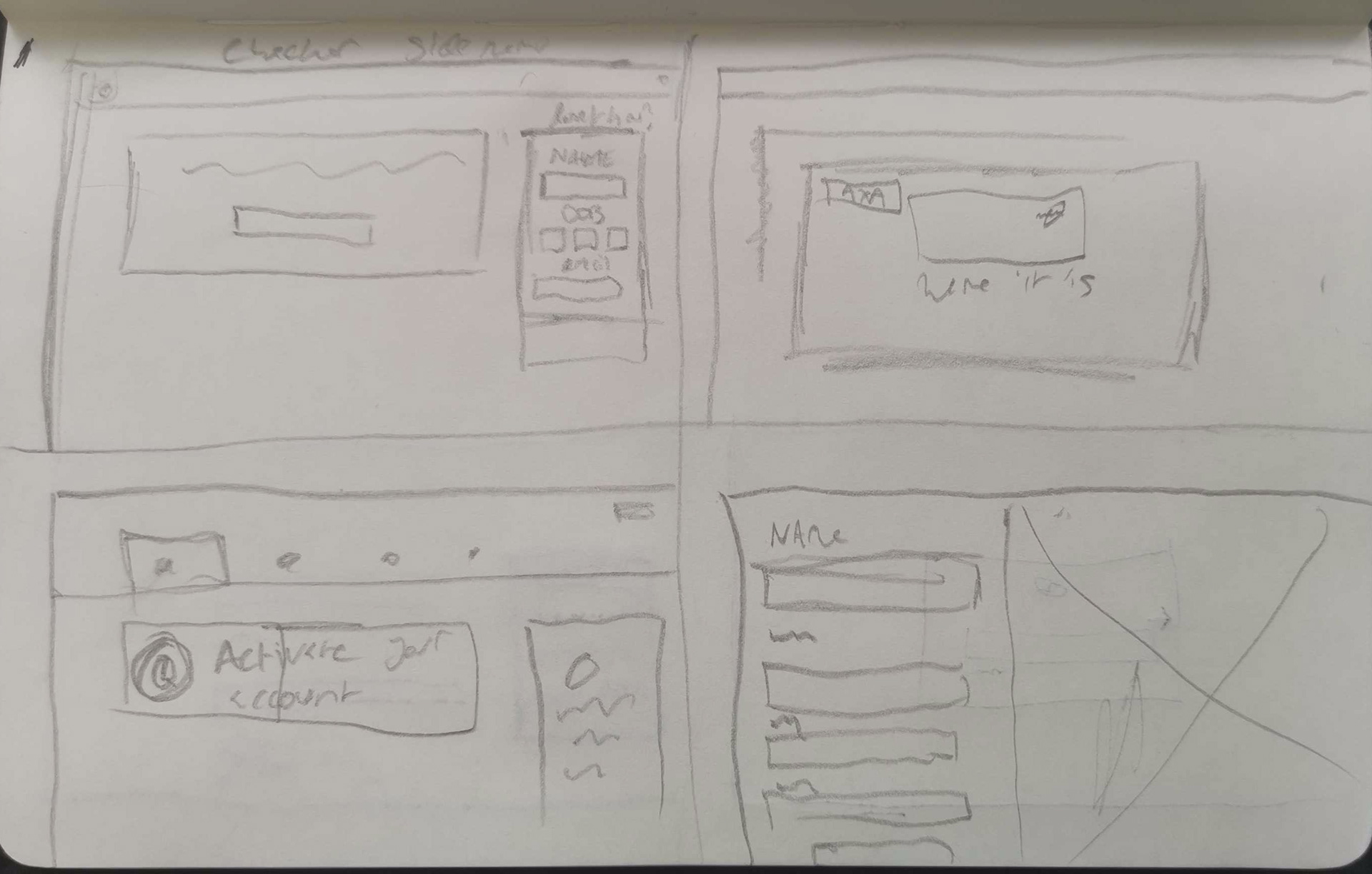
Crazy 8s!
Here are a selection of some of my favourite crazy 8s! 👆
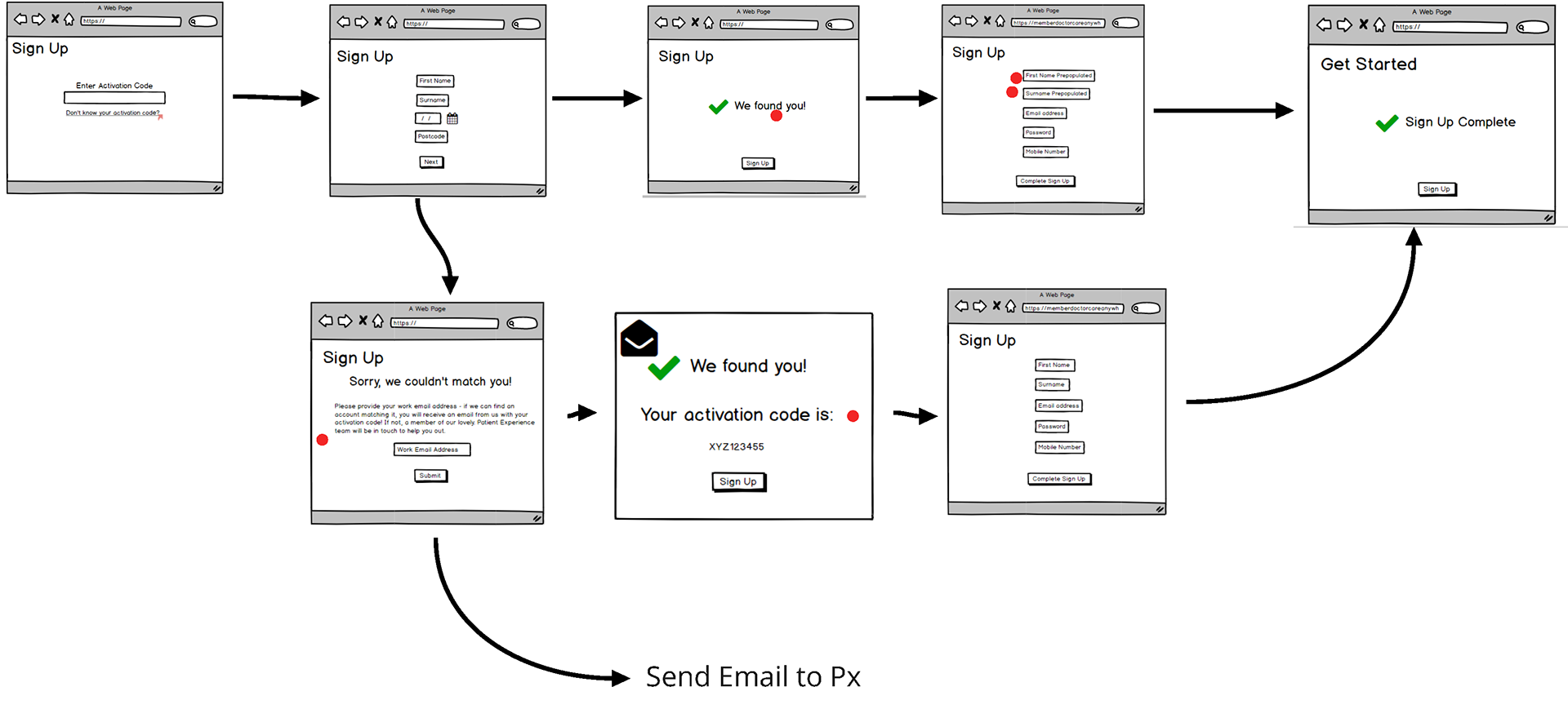
Low-fi designs of the flow!
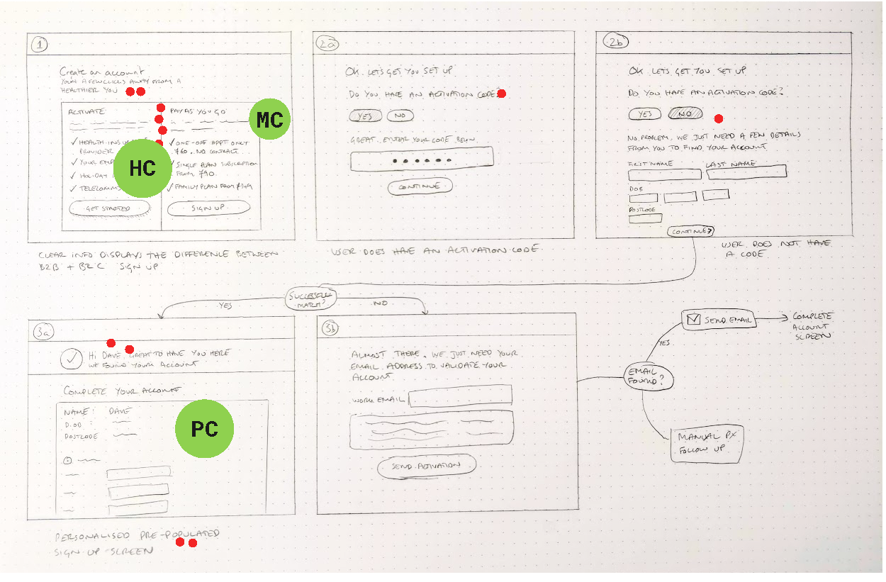
Low-fi designs of the flow!

Low-fi designs of the flow!
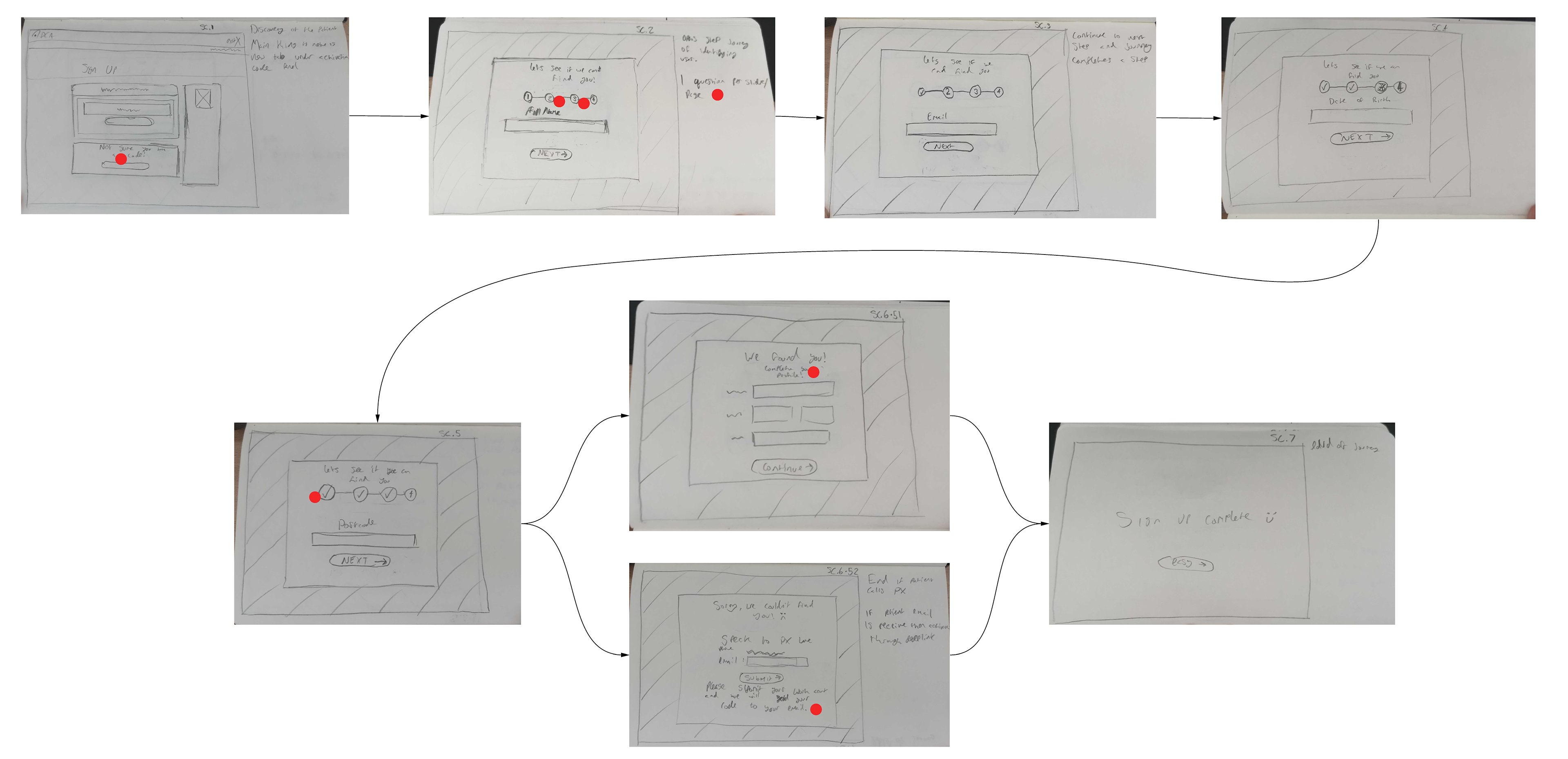
Low-fi designs of the flow!
Here are some examples of the rounds of solution sketching we did! Can you recognise a repeating flow?
Following crazy 8s and voting comes solution sketches, a very enjoyable exercise and it can really bring out some awesome merging and adapting of ideas. Something that arose from this was the under guise of an annoying UX problem.
The good ol' 1 field per page vs multiple on one page.
On a side note, something that I'm a big advocate is that a design system is an ongoing product and can be changed and adapted as visual and UX discovery expands, this felt like a great opportunity to be able to expand on our system as we develop and improve our general UX.
For this issue, I spoke with some friends and people I've worked with before at GOV.UK as something that is included in with their guidelines and is spoken well on is their use of 1 field and question per page. When speaking with some researchers and designers there, it was mentioned that either variation works, but if the amount of questions you're asking can fit onto a page, then that should work fine.
Generally as we weren't too sure on this and what types of screens users would be using we went for the 1 field option but something that we intend to A/B test!
After working on these and developing these into high fidelity designs, I started to develop them into a prototype. Something that I absolutely strive for! I faced an issue with how I was developing this interactive prototype for user testing, to use Anima or to use Protopie. I won't bore you with this but I went with Protopie for it's logic settings.
After development of the prototype ended, we began doing some user testing to recognise if the results would work with users and were appropriate!
If you'd like to test out the prototype, try it out here! 👈
After a set of testing, we gathered feedback and began to see if we'd got the best result for what we were after!
Validating and user testing
After gathering feedback from our user tests we began to alter the designs to better align with the feedback we received!
Some general comments were around our starting signup page not being overly clear and we started to change it based on some changes and to align with the design system a bit more!
Some design comments and notes against our design system!
These are some examples of design changes for the varying screens! Can you spot the differences?
These are some examples of design changes for the varying screens! Can you spot the differences?
Results and the final designs
After a set of changes from our validate phase, we had a set of design reviews to see if there was anything we'd missed.
These are the final designs that have been validated and signed off for development. After this, we'll work with developers to make sure the end product is to our standards, along with animations, icons and motion design!
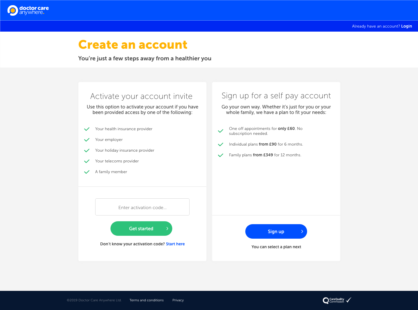
The main signup screen
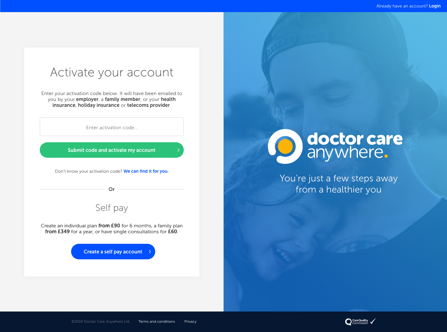
Our alternate screen we'll be A/B testing
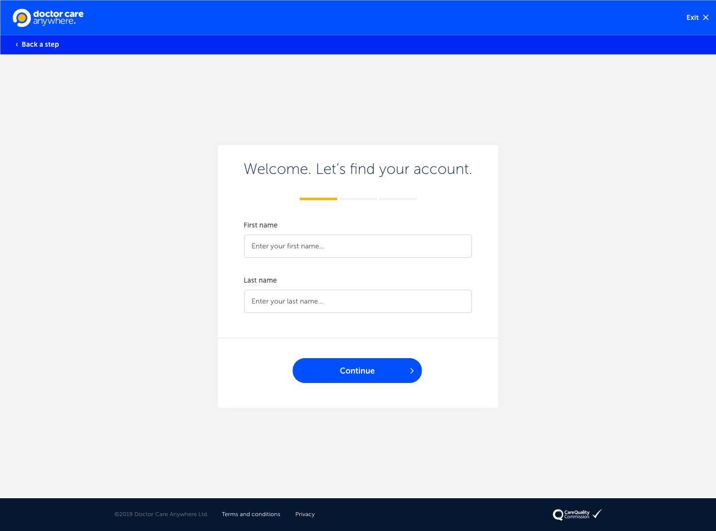
Step 1
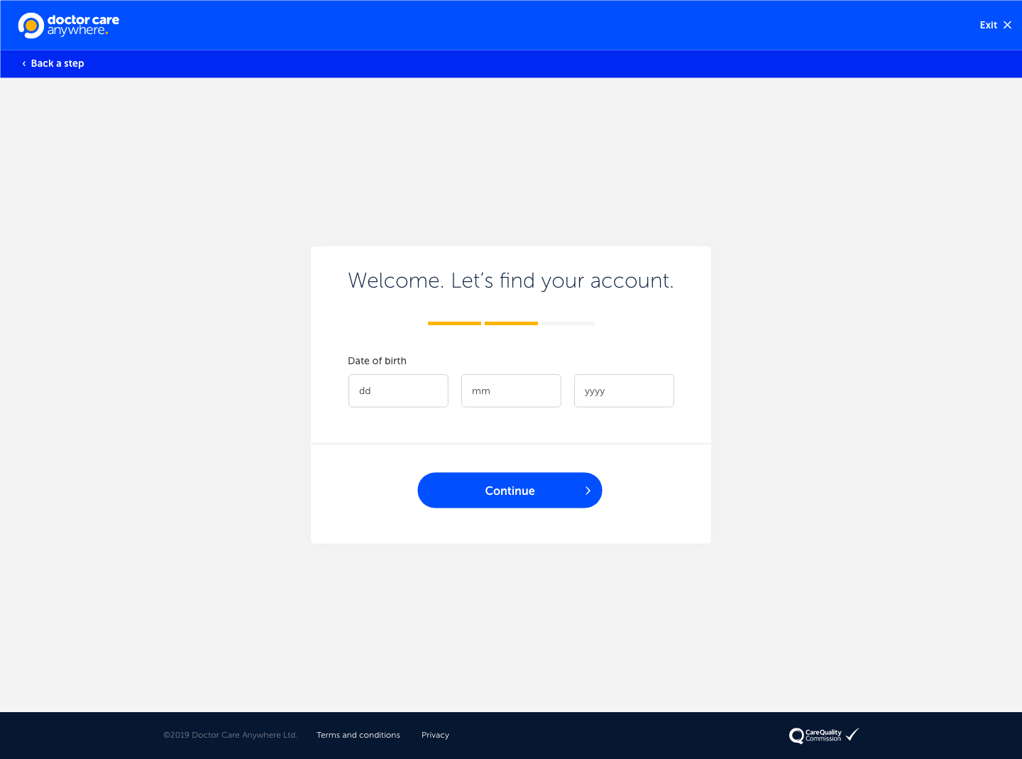
Step 2
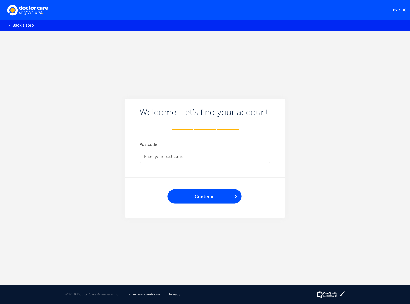
Step 3
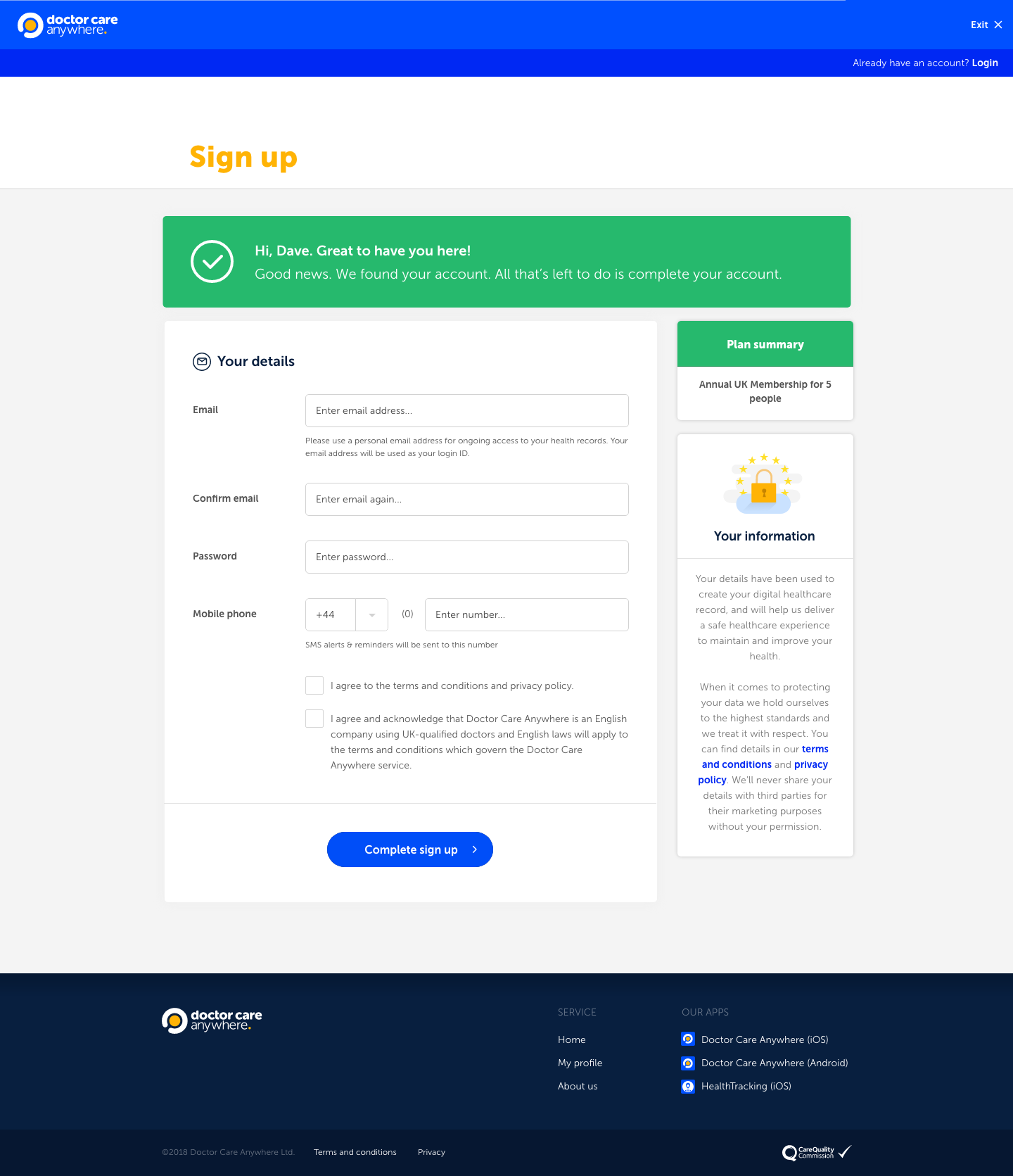
Complete account
Summary of the process
I've always loved the design process, there's something amazing about getting deep into an issue to develop a creative solution is incredible, who doesn't appreciate good design?
I learnt some really interesting things in this role. The ability to better user test in remote working, utilising A/B testing to its best and the which prototyping tools are the best for certain situations!
If I had some more resources, I'd loved of been able to utilise more users in my testing, Also, due to a rather annoying virus and global pandemic... A lot of this work had been done in lockdown! So I'd of loved to of been able to do all the design sprint activities in the same room as my colleagues and stakeholders!
