
This piece of work went on over 6 hours of development, where I went over a set of stages of my design process that I best believed to tackle the brief. This project has been incredibly insightful and has given me some great insight into ways of working within a game environment.
It's important to keep the player experience prioritised throughout as the screen will be a hub of users main interaction point throughout the whole game.
Reviewing the brief
When I receive any brief, I like to comb through and break out the most relevant sections into areas that would be important for the upcoming piece of work.
Making notes at this stage I find greatly valuable, through my past experiences and knowledge of game trends I will tend to have ideas sparking as I progress through.
From taking looks through the brief, reviewing the reference materials from Dirty Bomb, I start to take a look at some references and inspiration from other games of that have accomplished great and interactive main menus that improve the overall player experience!
The main takeaways from this stage was the personalisation of the hub, providing the user information on their main stats and how they are performing in the game. Social features are important to prioritise here so giving the user some quick actions to get into the fight will be key!
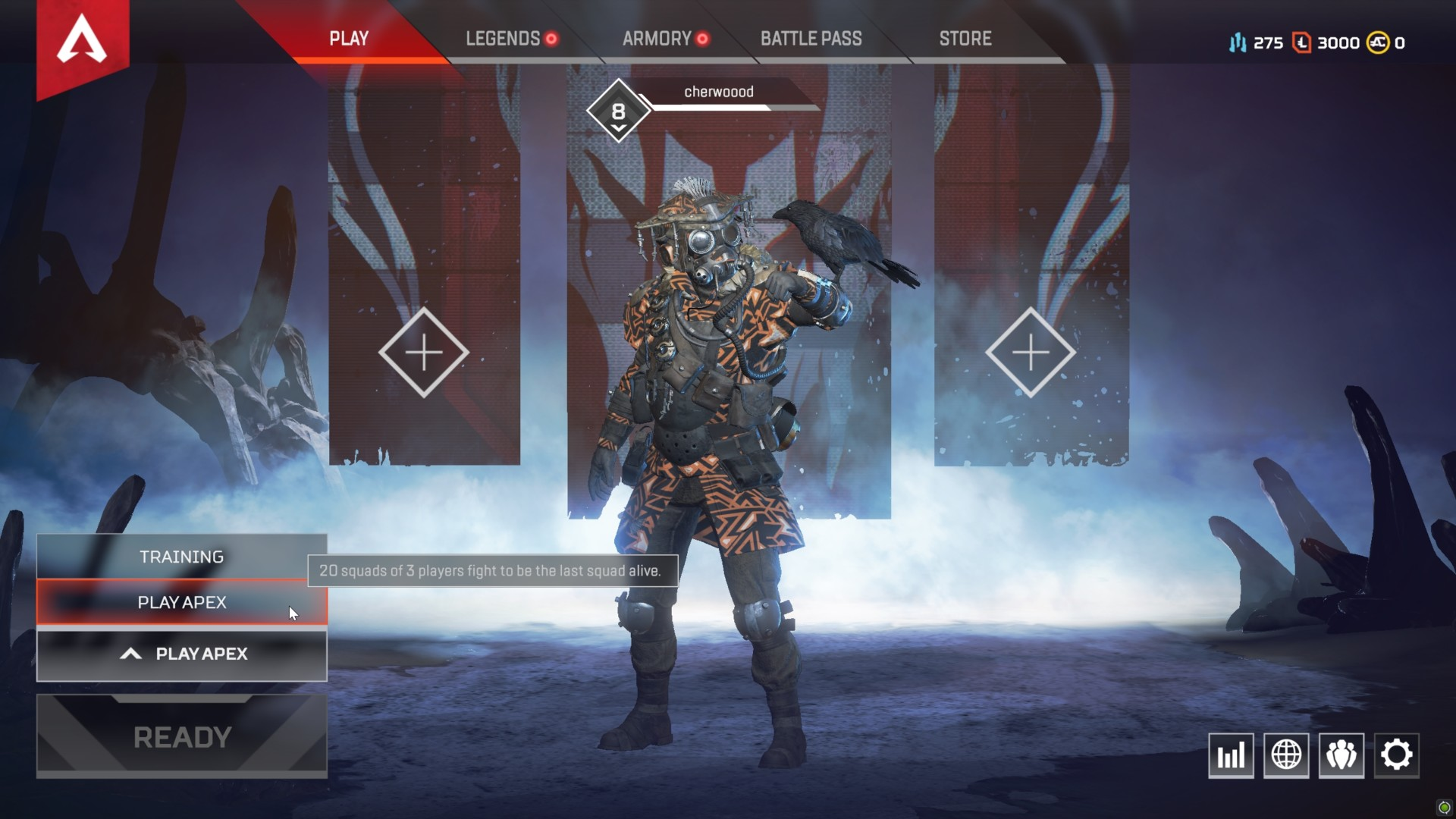
Apex Legends

Rainbow Six Siege
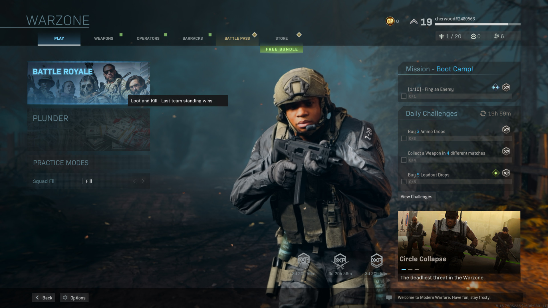
Call of Duty: Warzone
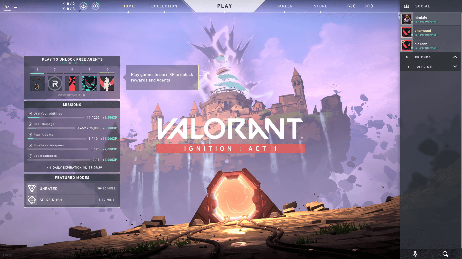
Valorantt

Overwatch
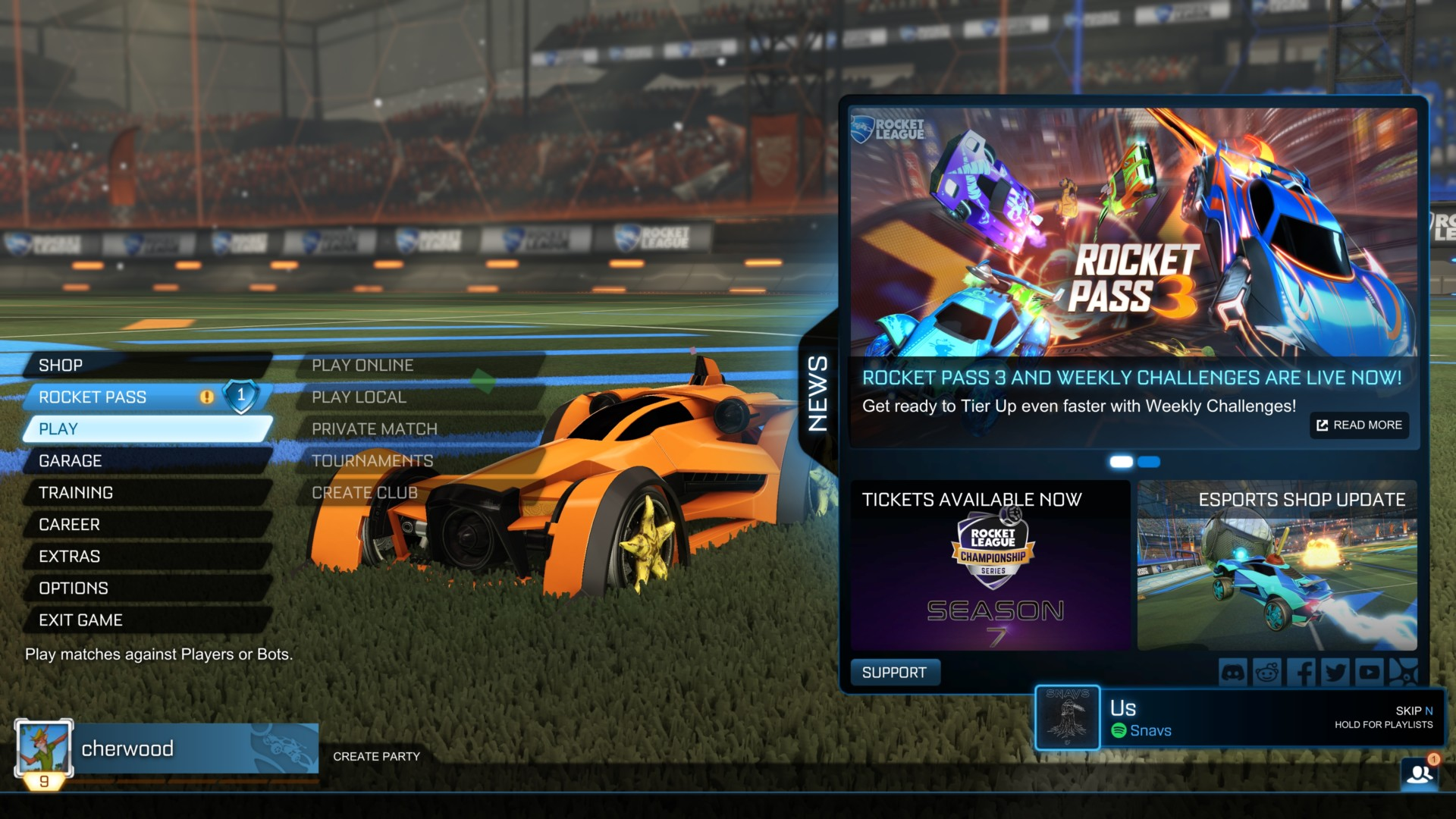
Rocket League
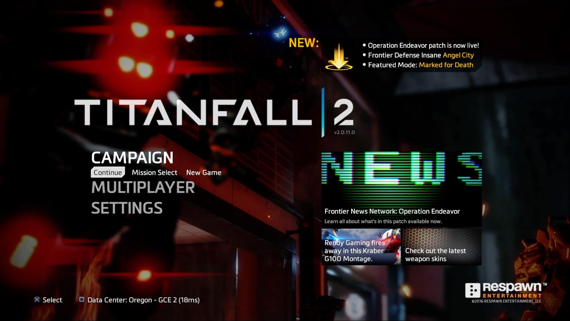
Titanfall 2
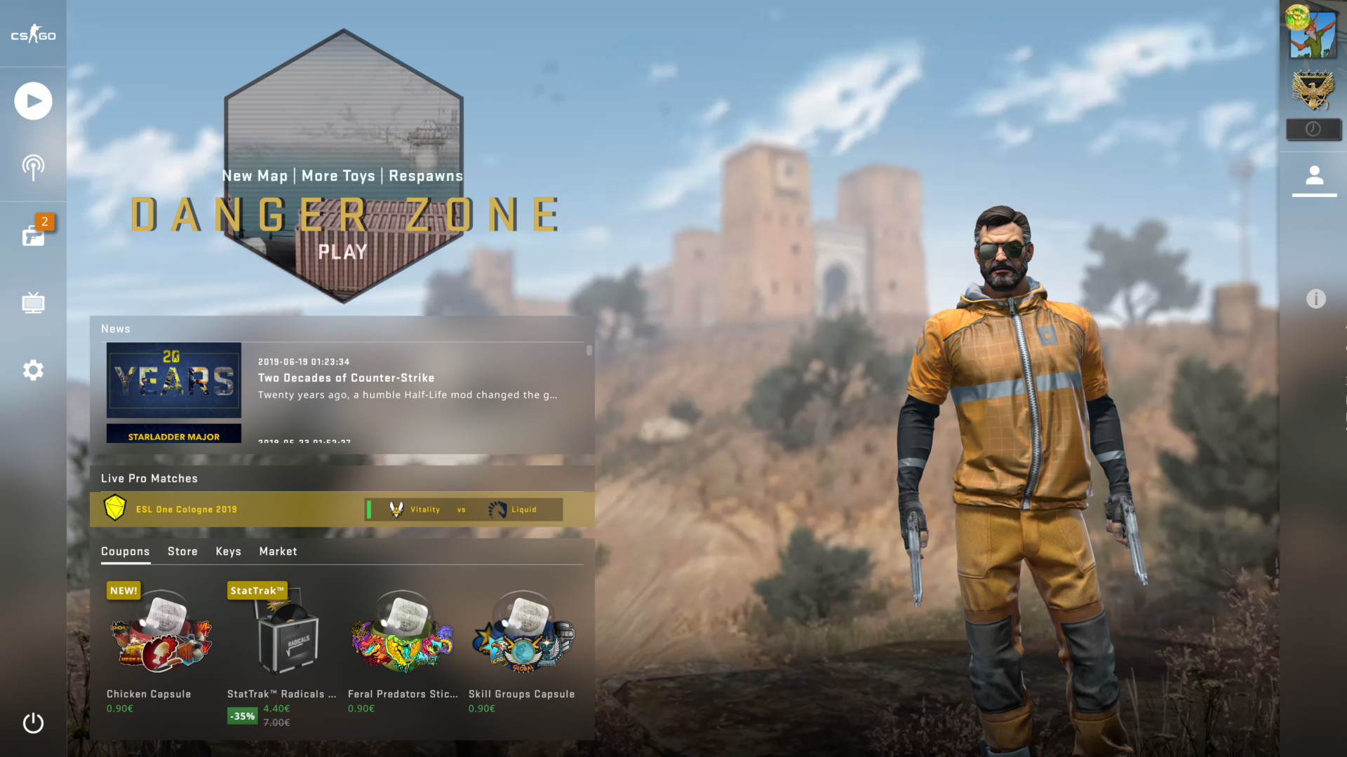
Counter Strike: Global Offensive
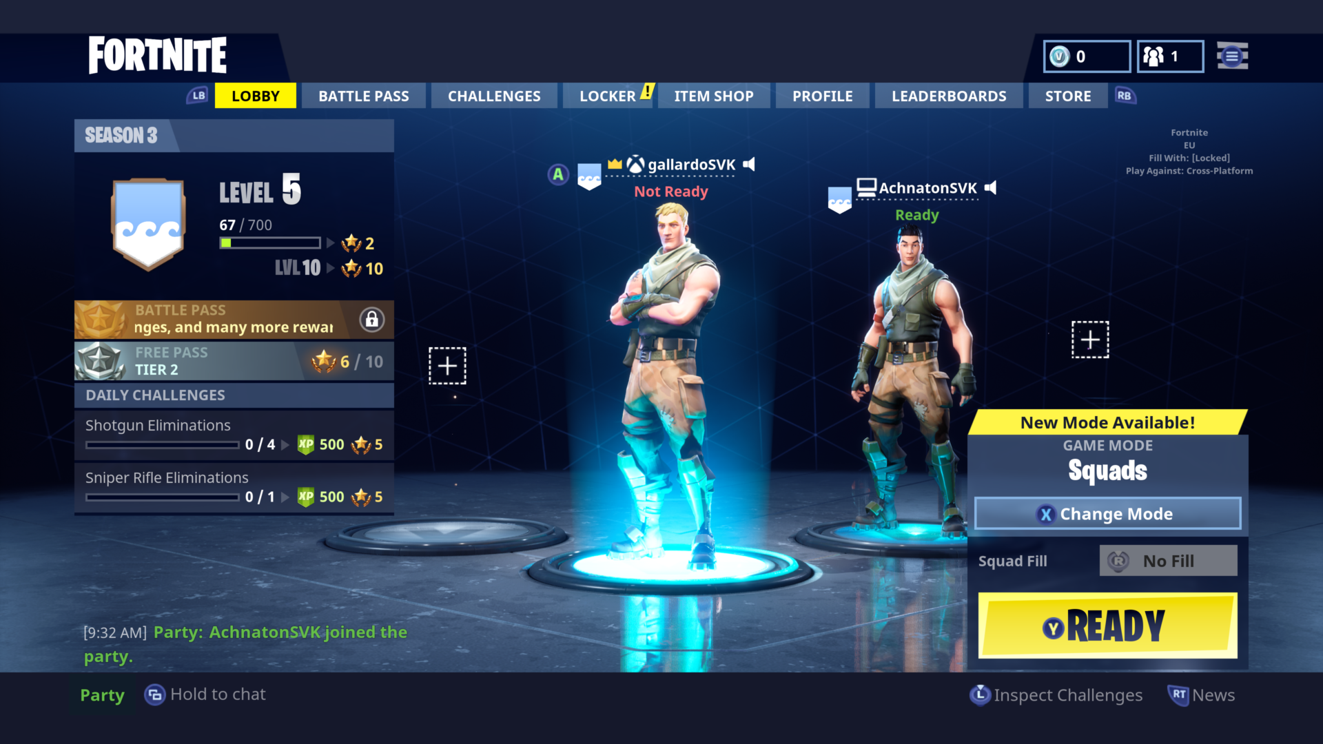
Fortnite
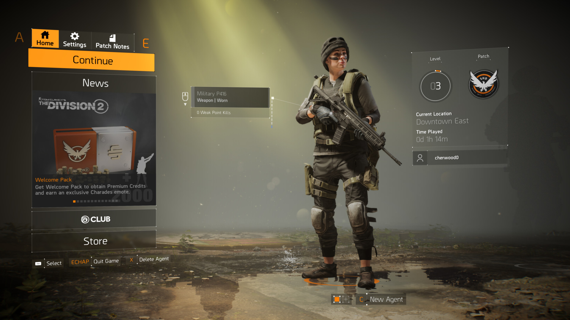
The Division 2
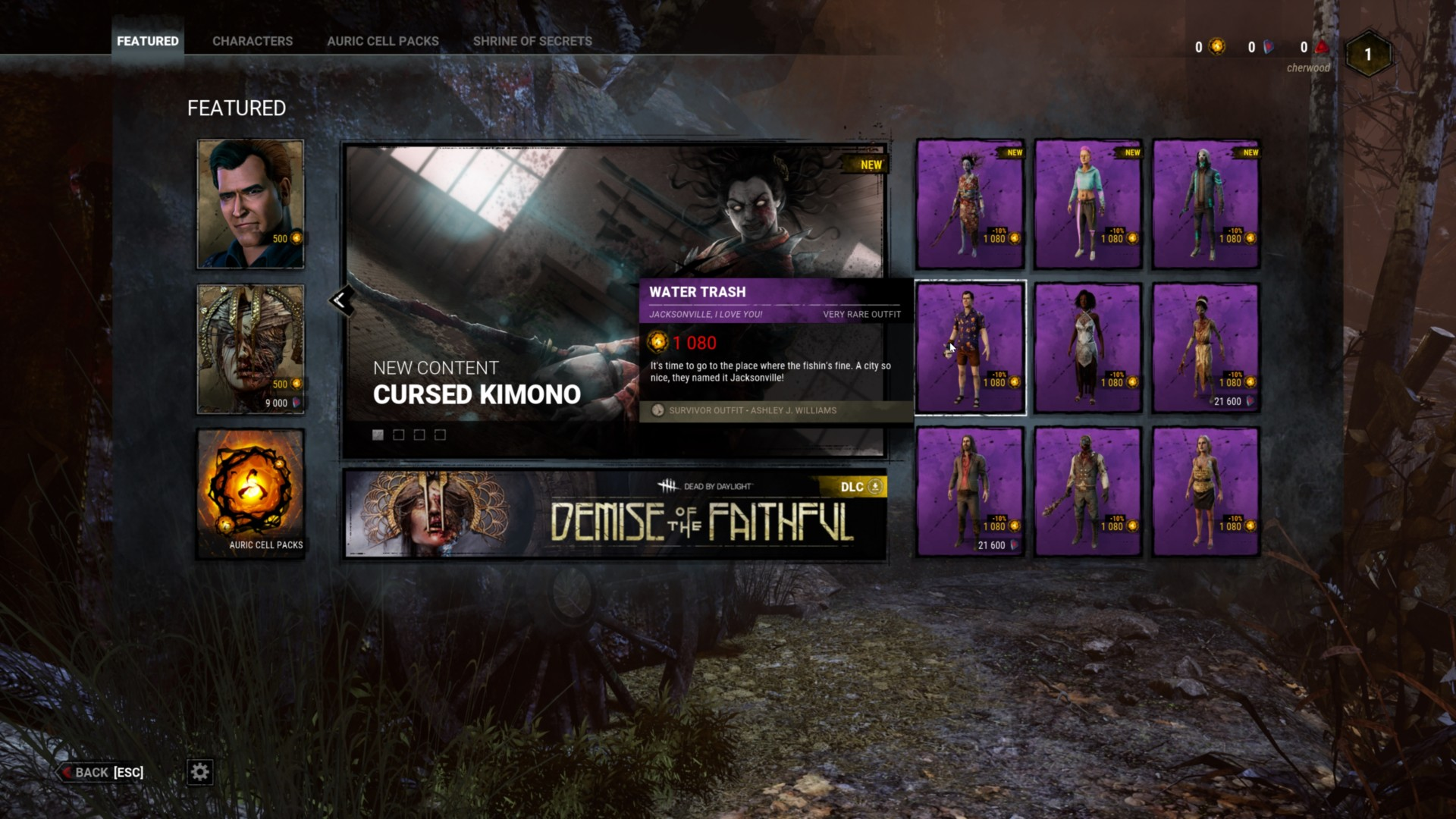
Dead by Daylight
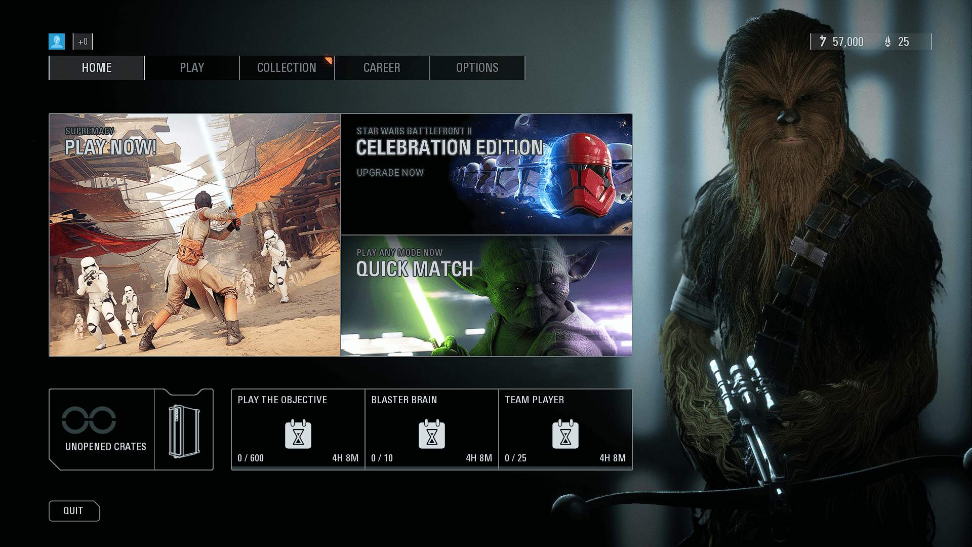
Star Wars: Battlefront 2
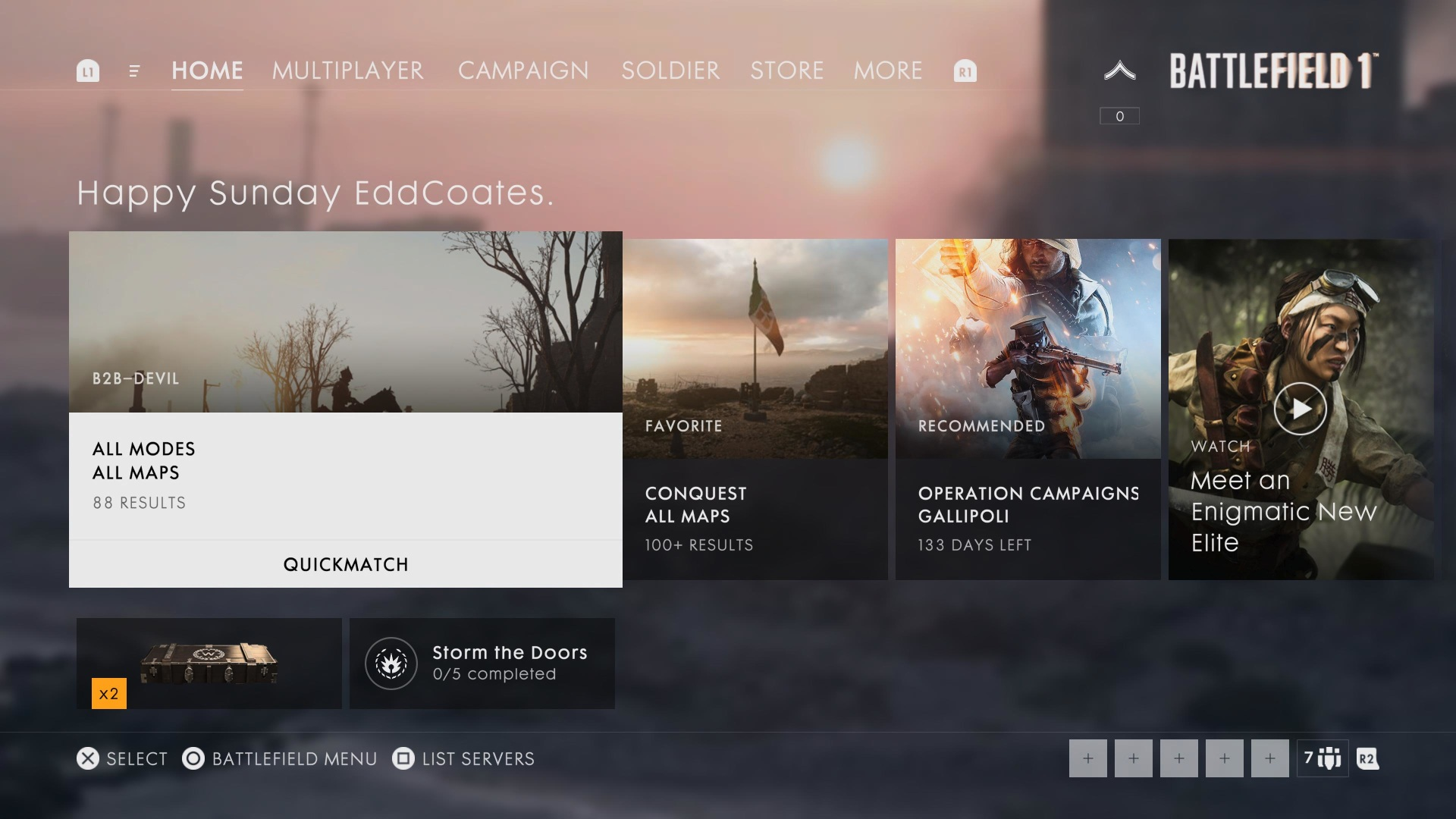
Battlefield 1
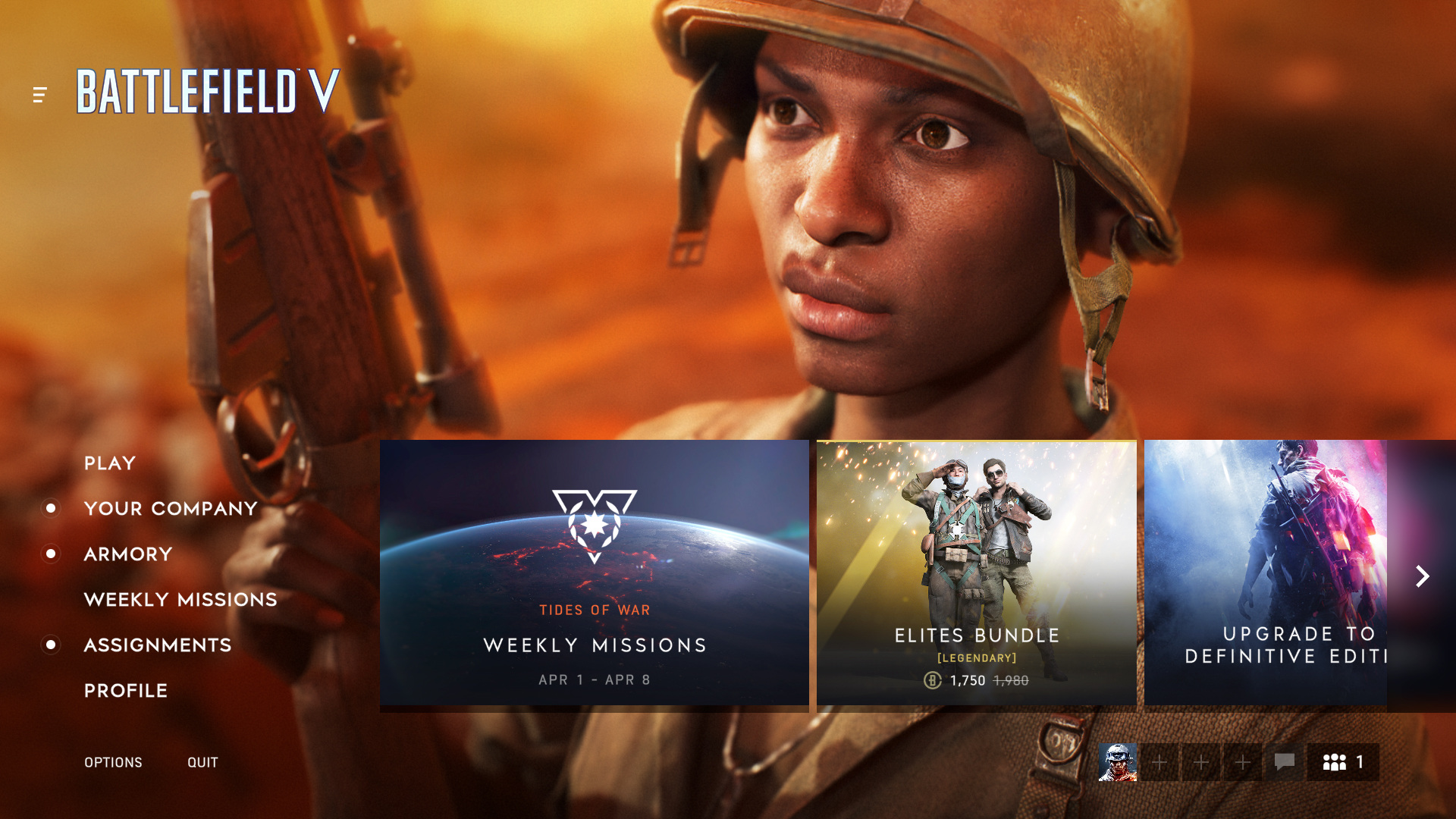
Battlefield 5
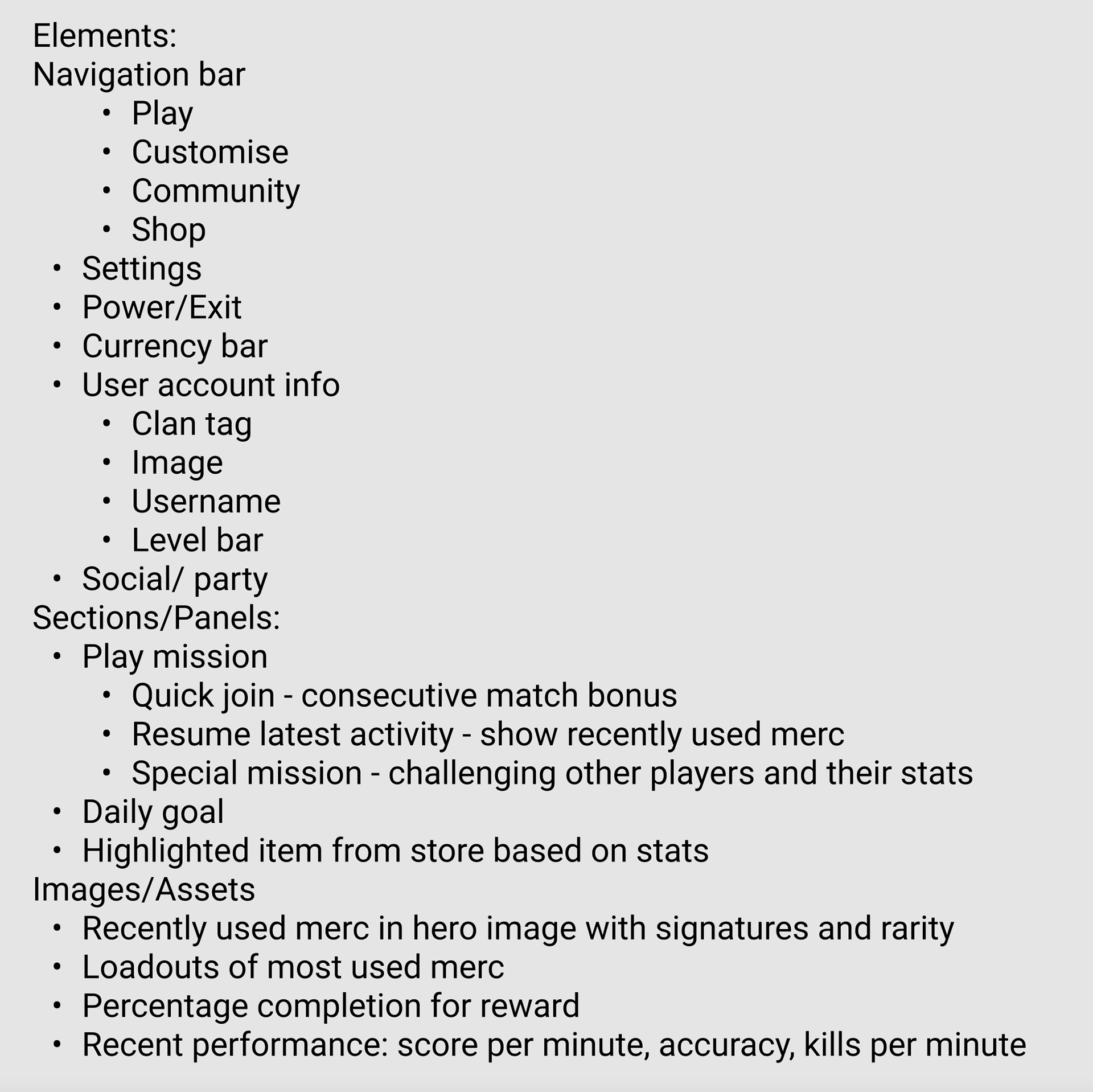
Establishing a feature list
After reviewing the brief and taking a look over the inspiration, I started to put together a list of features and elements that I will be incorporating into my design.
Gathering what needs to be designed for a piece of work like this is very important as it can define proportions and layouts of particular elements in the wireframe stage!
See the image on the side to get the list of features that I ended up with!
When detailing the features, the user personas that I wanted to support were rather generic! Every player will be interacting with this screen so understanding the certain requirements that the player will need. Such as:
- As a player, I want to quickly join a game from the main menu
- As a player, I want to resume the activity that I was previously playing
- As a social player, I want to quickly invite friends to my party
- As a business requirement, I want users to have personalised items prompted to the user on the main menu
- As a player, I want to see my recently used merc on the home screen
- As a social player, I want to be able to quickly challenge other friends scores and activities on the main menu
When working these personas and requirements into the feature list, I understood what would require priority over other features.
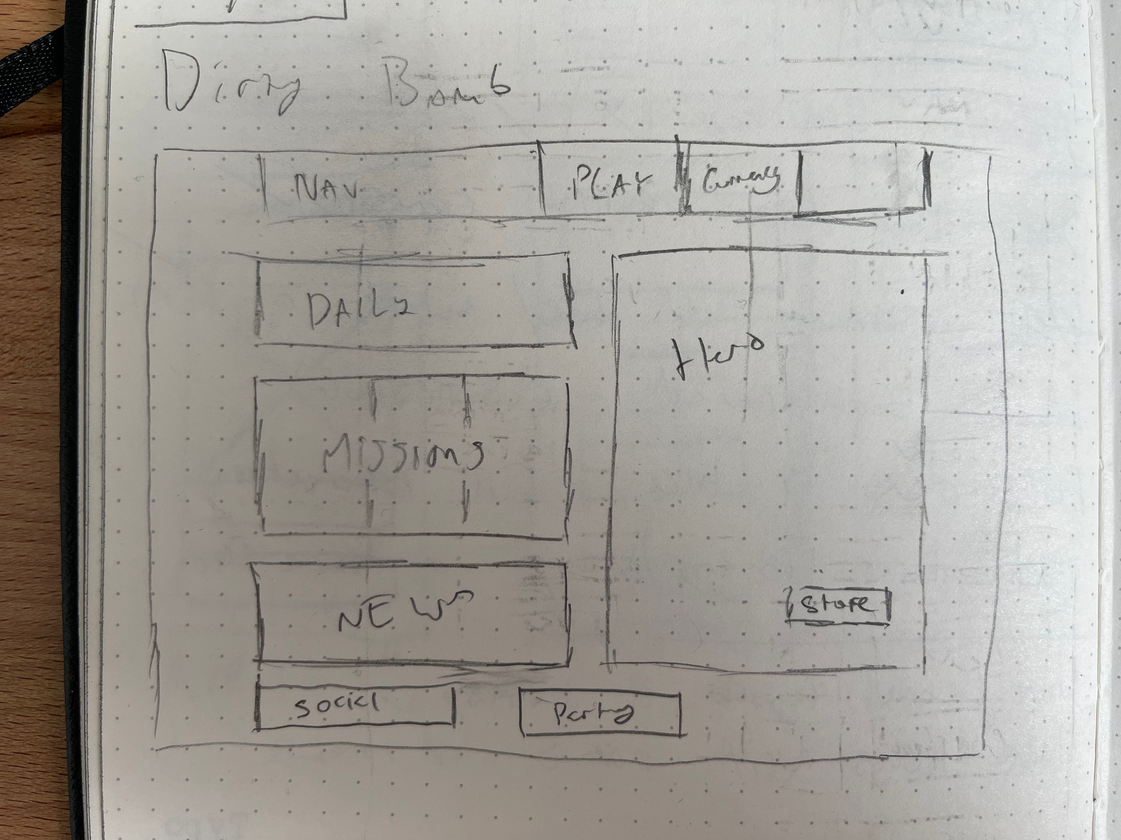
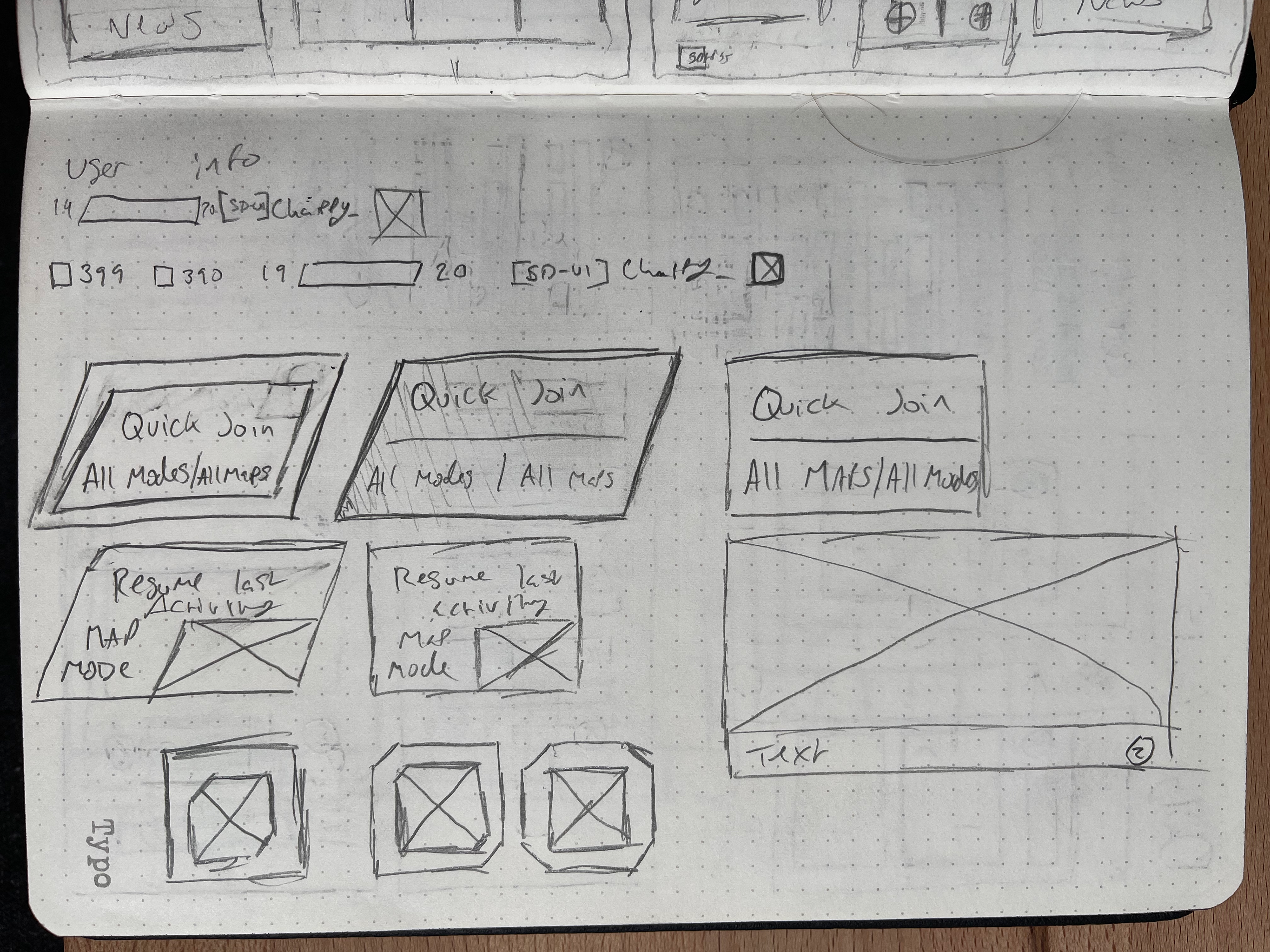
Sketches and Wireframes
The good stuff! When beginning to piece together wireframes I like to take a look at the inspiration or project that I will be working off of! In the first image below, I took a review of the general IA of Dirty Bomb, the game that I will be designing an in-universe of. I took inspiration from this for developing the wireframes.
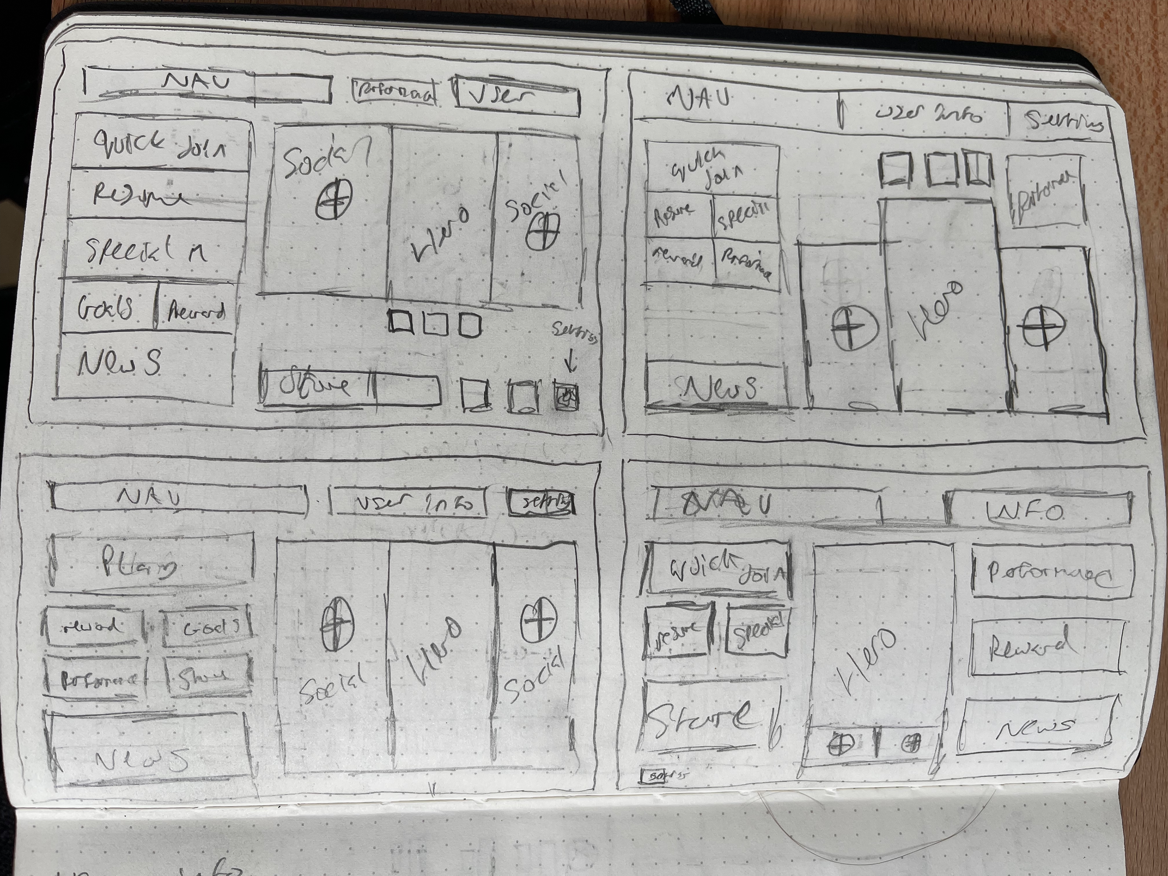
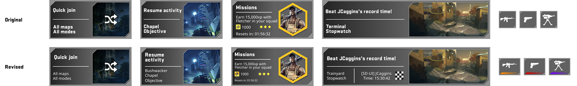
Starting on the first wireframe following the IA image - I started to try and get as much information in as possible from the brief, I prioritised the social aspect and decided on keeping the user information and navigation on the top of the screen! From this first set, the bottom left is one that I'm a fan of! The grid layout along with the hero image being centred around the player stats is something that I feel will be effective in the final outcome!
The second set of wireframes were where I pushed the hero image to the right side and began to push the size of the assets and to group the loadout, performance and the store items together. Along with splitting the main buttons to be featuring the priority buttons on this page; Quick join, Resume activity, Special missions, Daily goal/missions and a reward for player performance! Within this set, the first option is something that I really enjoyed with the organisation of the menu buttons and how the hero assets are treated.
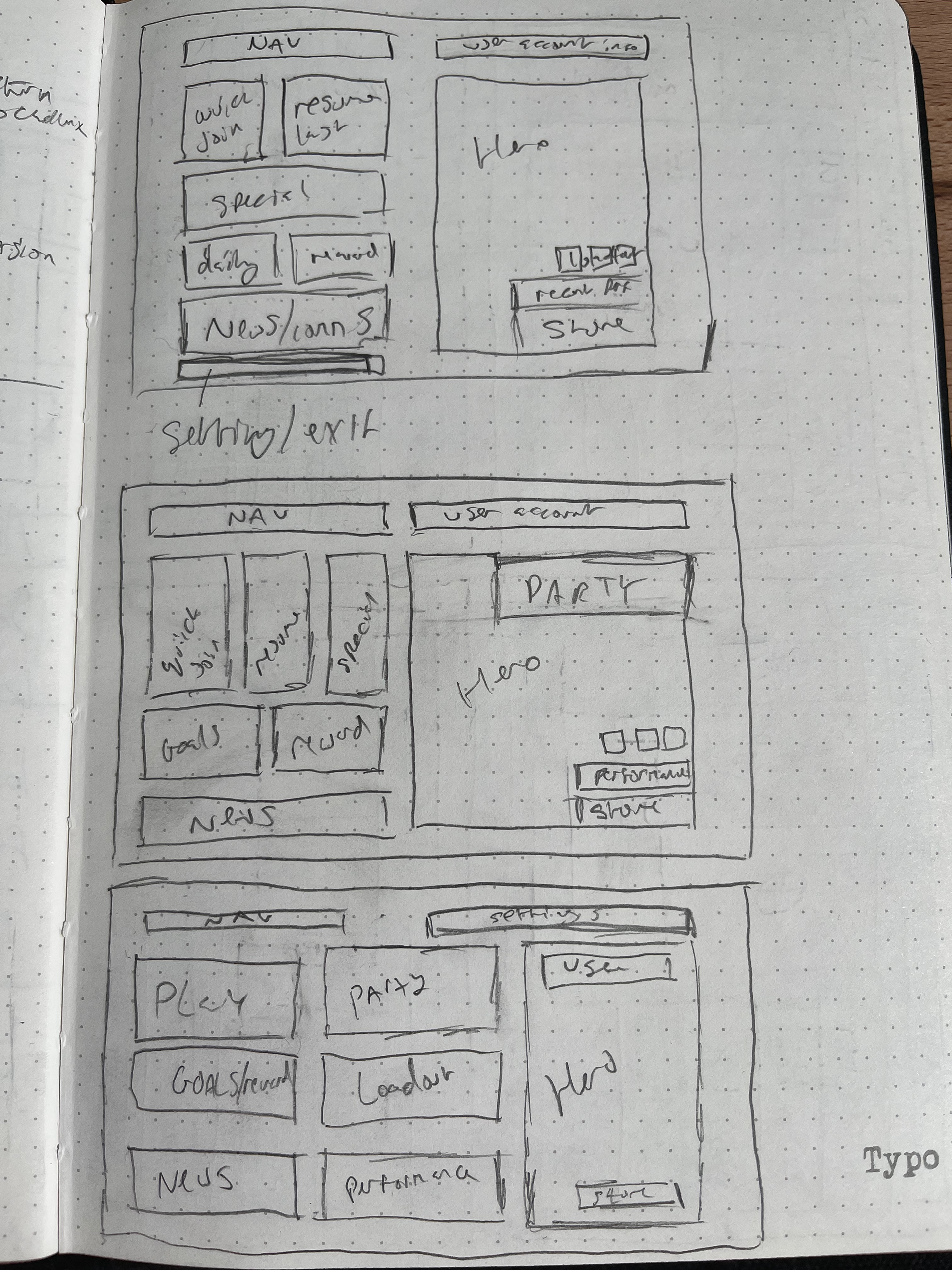
The final sketch page here is some quick assets and experiments with some visual styles! From looking at the navigation bar organisation - it makes most sense to have the profile and username on the right side then going left having the EXP bar and the currencies.
I decided to reuse the existing EXP bar and currencies from the Dirty Bomb menu. In my belief, re-using an important asset set like this from the same in-universe game is important. For users who are similar with the style of game, viewing similar assets will allow them to settle into the experience quicker.
Along with these assets, I had a few tests of different panel styles - I found visuals with a geometric inspiration and frame around would be most effective!
Reviewing current Dirty Bomb IA
Wireframe 1
Wireframe 2
Wireframe 3
Digitising wireframes
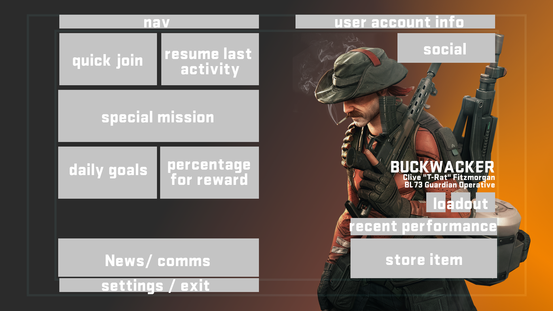
Moving wireframes into Figma is something that I found to be a quick but rapid way to setup layouts - in this layout, the setup that I have on the right is one of the top wireframe in the second wireframe set above! Following this, I started to work with the different elements that I would need for the designs!
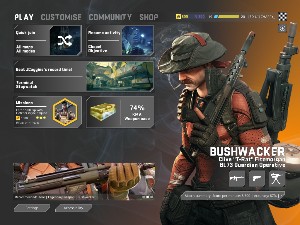
I included a large hero image of the Bushwacker character and text to allow for a personalised feeling for the player. Including support text to show the character name and information on a rare item for the merc - this gives a great feeling of achievement and personalisation for the player.
Showing a rarity highlight in the background is something that I had wanted to include when I decided on the thought of showing a hero image. There's a great example of this within Rainbow Six: Siege when a player has a high quality item equipped it will impact the main menu to reinforce that the player has put in the added effort for them to be proud of! I aim to animate this and to evolve the background to feature context for the player.
Designing this screen (as you may be able to see) includes a safe area to allow for the simple and accessible positioning of elements on screen. Here I used the 80/90 rule, where the inside border (80%) will include all the important information that will require immediate access and the outside border (90%) can house elements that won't be used a great amount. This isn't used often currently due to overscan and the ability to move the "safe area" within games has been introduced! This isn't used often within the Playstation requirements but is always great to keep in mind!
Developing the style
After developing a general layout I began to develop the design system of my screens. I found an asset online of the Dirty Bomb font (found here) as a general header for navigation elements, hero images and headers for panels. Following this, I used a font called Noto Sans (found here) to use for body copy as it gave a great use case for clear text as the font sizes grow.
When planning this, I planned to create visuals for both Xbox and PC. Both at 16:9 and 4:3 as the brief dictated!
Within the Microsoft XAG (Xbox Accessibility Guidelines - found here) it details that at 1080p the minimum font level is 26px for Xbox and 18px for PC so keeping this in mind is important.
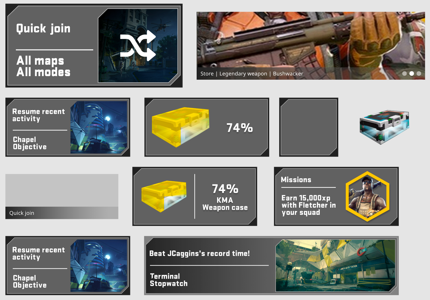
From developing the wireframe assets into digital representations, I ended with some general styles that I wanted to progress with! Using the panel style, with a cut in the corner and stroke, it gives a style reminiscent of sci-fi and militarised assets. For a store visual, having a simple gradient and a large feature image with an accordion indicator in the corner! I felt like I ended up quite well with that so decided to keep on with it!
Featuring a large asset relating to the map or merc referenced within the panel allows for some added emphasis to it! Also negates the user from making any "user errors"!
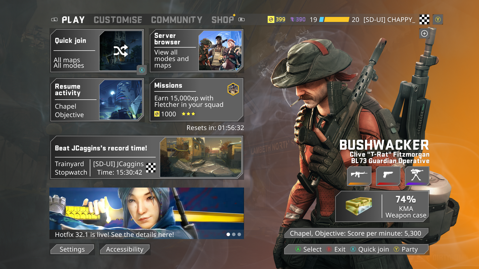
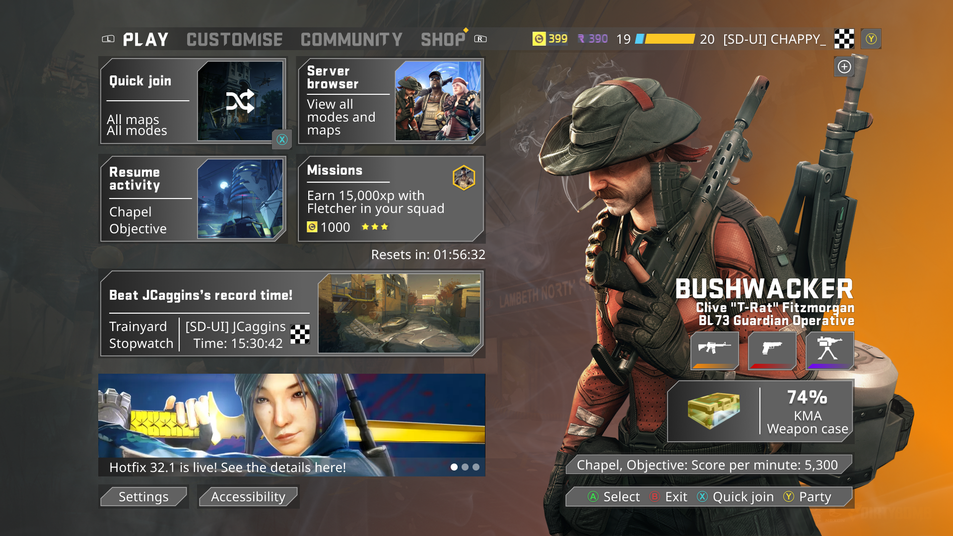
Designing the screens
Below are the first iterations of the designs for the main menu!
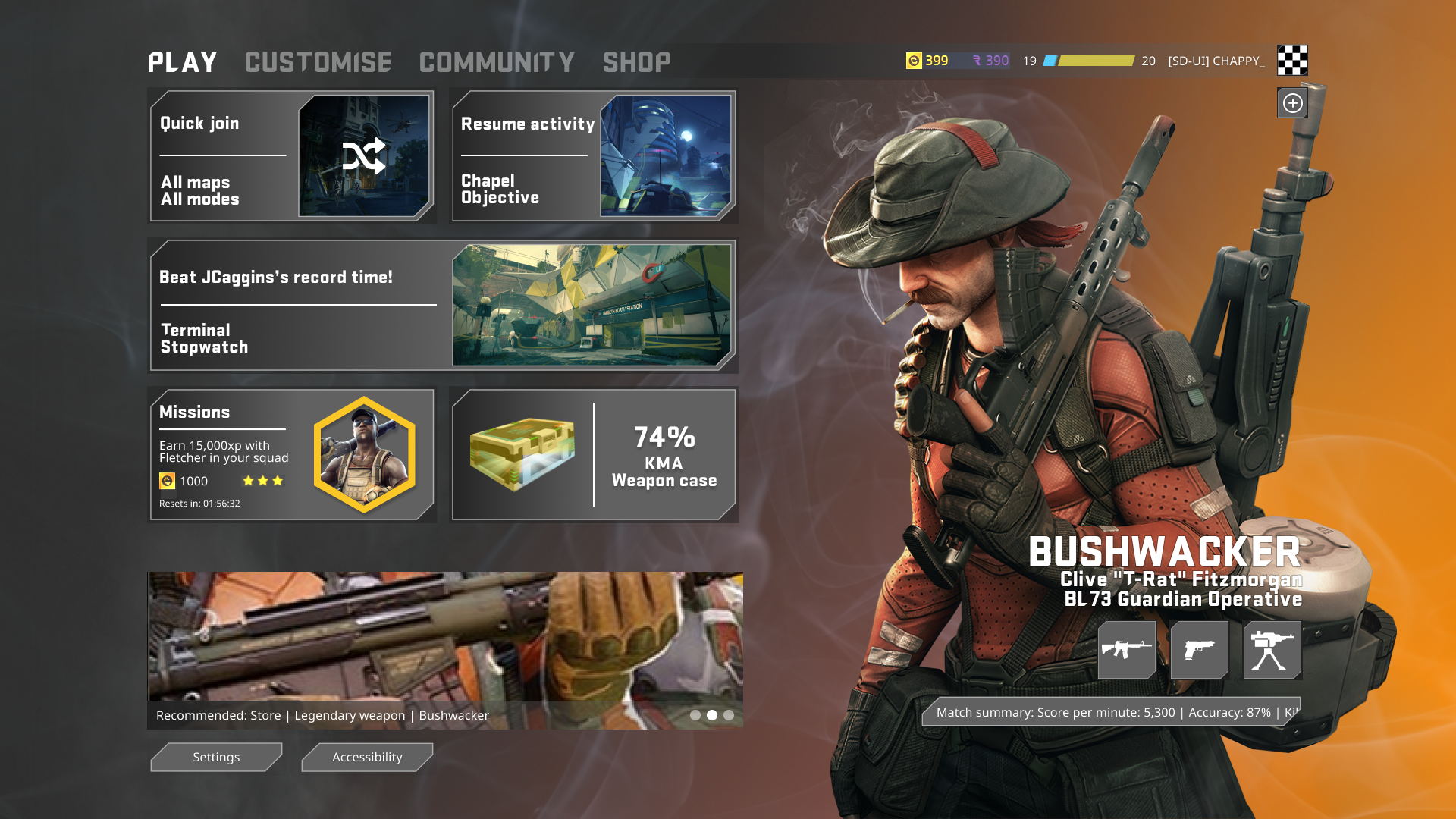
For the background, I added a simple fade from black to red using the colours shown within the Bushwacker hero image. This gives an added personalisation and tie in for the user and ensures that the assets are linked! Along with the rarity highlight behind the image, I added some detail of the users loadout!
When developing the top navigation panel, it began on the top left with the navigation between pages, within these sections, I laid out general some active, inactive and hover states. To the top right, I included all the player information. Here I set the player profile image as a temporary checkered box, the username and clan tag using the body copy I developed within the design system along with the currencies from Dirty Bomb and the EXP bar, retained for player experience. Included at the top is a party creation option, a quick add option which is valuable for a social game such as this!
For designing the panels, I flip-flopped on the concepts multiple times but decided on a darkened visual style with a gradient in the background of each panel. With a simple 2px separator, it allows for updating of the panel without the need for heavy copy and layout changes! The middle panel is a distinctive extended version of the other panels - with a personalised challenge it allows for a quick and interesting introduction to the game!
The bottom of this section features the daily missions and performance reward that the user can unlock through certain actions. In the missions section, it gives a brief description of what the user should be attempting to complete, along with the currency rewarded, difficulty of the task and when it resets! I didn't prototype this but this would move forward into a visual that would allow for prioritisation and swapping of this challenge. The reward panel gives a simple visual of the players progress and what they will be receiving, included with it is a teasing of the box being slowly received using a golden gradient.
The store graphic was something I wanted to make distinctive enough that could also be used for news and communications within the game! Underneath the store graphic, I included the settings and accessibility options within here, something that I noticed within Call of Duty: Cold War that I found to be a great place to put it.
On the right side along with the hero image, I included the loadout that is equipped with the merc along with the most recent match summary, which I used a side scroller, with full development of the designs a full screen detailing all the information would be great.
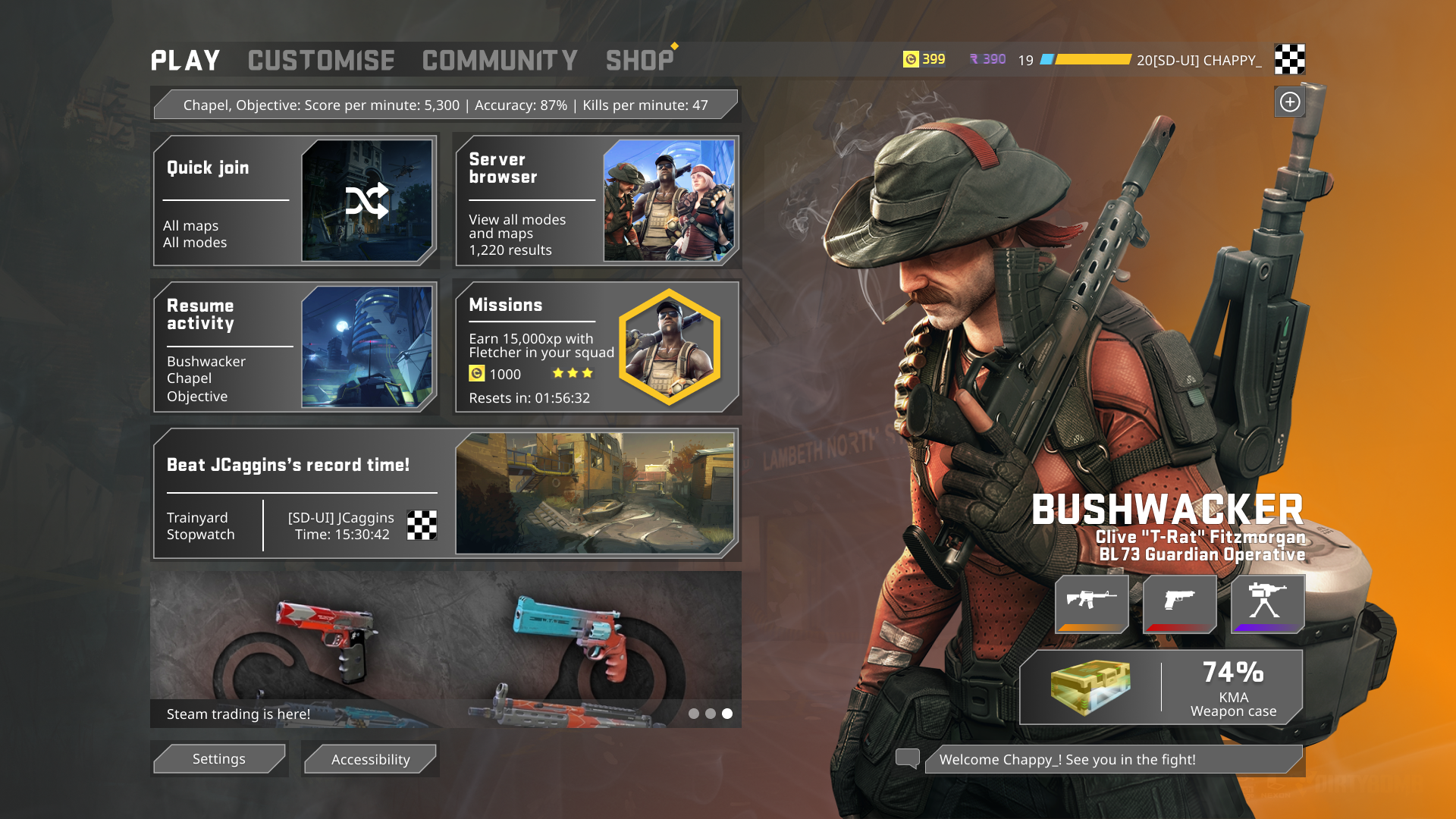
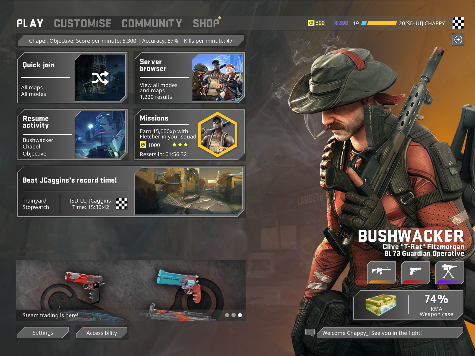
UX improvements and iterations
After my first design, I reviewed the state of the first iteration and made note of several things, such as the number of fonts, the level of interactivity, adding some extra detail to the background, showing rarity of the loadout and making some variations to the layout of the left panel to properly match the XAG guidelines referenced above!
From this point, I began to work through the first iteration, adding in a map to the background behind the gradient is a great way to get the user into the experience without needing to render and entire environment, if I was to develop this for the actual game I would use some kind of 3D visual within the game.
From progressing the visuals, I began to refine down the design system to remove the quantity of font styles used! As well as this, I began to improve the visual consistency and making them more accessible to the panels as seen below.
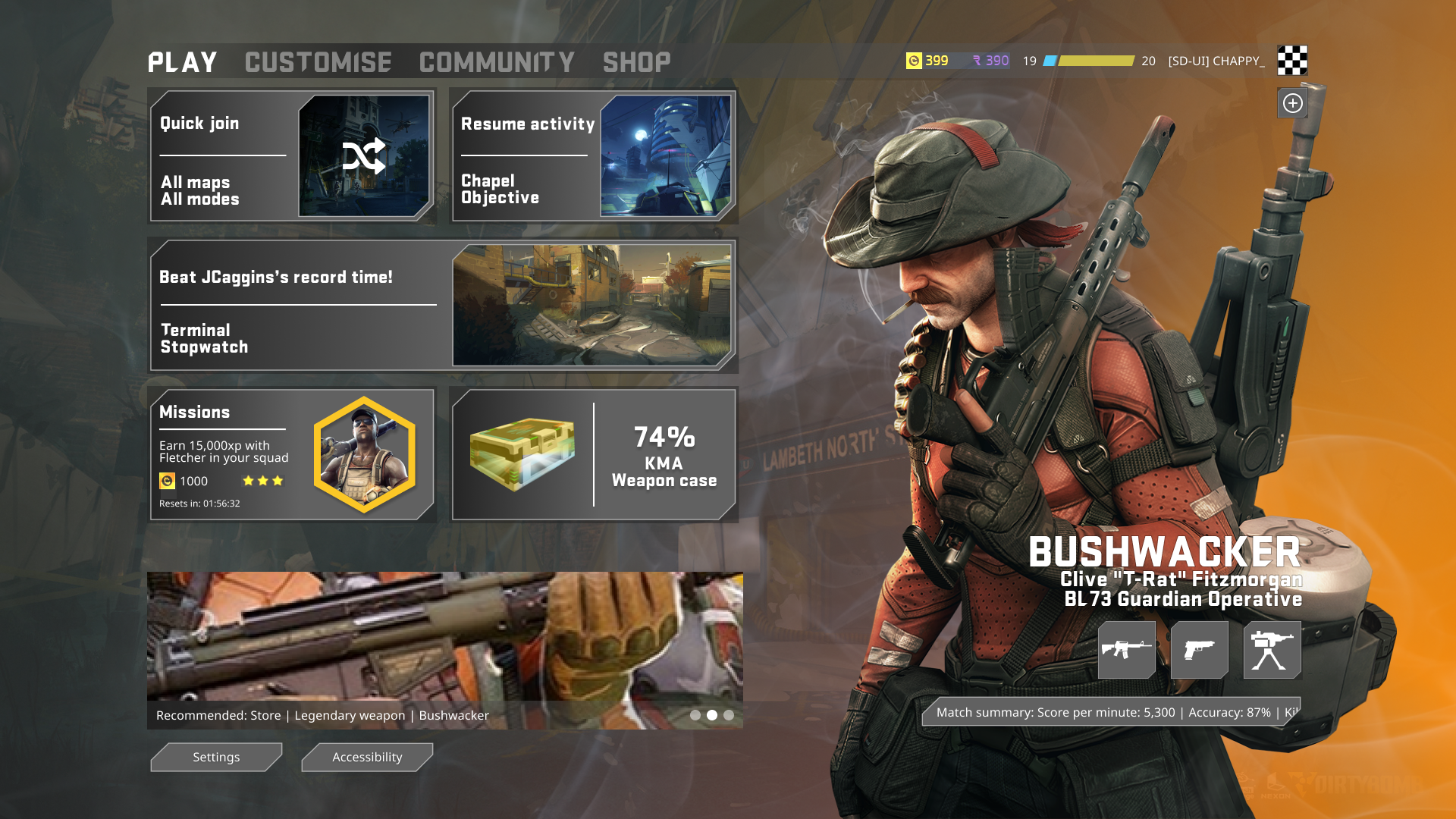
After these improvements, I began to develop the remainder of the assets and panels so I could develop some micro-interactions around the users interaction. I decided for a hover state, outlining the internal section the yellow that I had been using to highlight areas of interest such as the XP bar. I had decided on a simple hover state with an overlay on the right side of the panel.

Design system and assets that I finalised.
Text/ colour styles
Gamepad iteration
Following the generation of the PC design system, I began work on developing the styles of the gamepad variation for either when a user plugs a gamepad into the PC or if the game is used included with the Xbox Game Pass.
When developing this version, I planned to setup a series of quick actions which are displayed on the bottom right where the chat function of the PC version would live. The user can quickly join a game using the X button on the gamepad and can access the party/social functionality through the Y option.
Also added were LB and RB bumper indicators to the navigation to allow for rapid movement between different sections of the menu.
The design system hadn't needed to be adapted much to support the XAG guidelines for this support as you can see below.
Design system and assets for the gamepad version
Final designs
There are 2 variations of my final design, one which is to be used on PC and the option when the gamepad is plugged in. To swap between these 2 versions within the prototype, press the C button on your keyboard.
On the right here - you can use the prototype, I've attempted to make it as interactive as possible within the setting of Figma! I encourage you to take a look at it in full screen. Forgive me if the fonts don't display properly! Embedding Figma prototypes sometimes breaks fonts!
You can see the final screens below within the grid, both at 16:9 and 4:3.
I'm happy with my final designs! With some added time I would begin to look at how the panels would interact and what opening them would look like! When thinking about the transitions between tabs, I would utilise the 3D space used within the background of the page.
16:9 - PC
4:3 - PC
16:9 - Gamepad
4:3 - Gamepad
Resources and Assets used: GameUIDatabase, InterfaceInGame, Smoke, Dirty bomb game map visuals, Chat icon, Dirty Bomb font, Controller font, Microsoft Accessibility Guidelines