The Brief
To conduct a design evaluation of 3 interfaces from distinct delivery medium, a website, a mobile application (IOS, Android or Windows) and a digital interface of your choice (smart watch or an ambient technology for example) and select 1 item to redesign. The purpose of the redesign is to significantly improve its usability, aesthetic and interaction quality. The outcome of the project should be a working prototype to demonstrate your interface redesign.
The Solution
The TeamViewer app at the time of the design was over a year old. Their original design lacked general usability problems and general visual consistency overall throughout the app.
The final result, a working prototype created in Sketch and Zeplin with a large amount of improvements in usability throughout the app including an updated visual style consistent with other TeamViewer products on other platforms.
After a few months of this project being submitted, TeamViewer released a redesign for their Android app which had similar solutions, showing evidence of my design decisions.
The Plan

Design Development
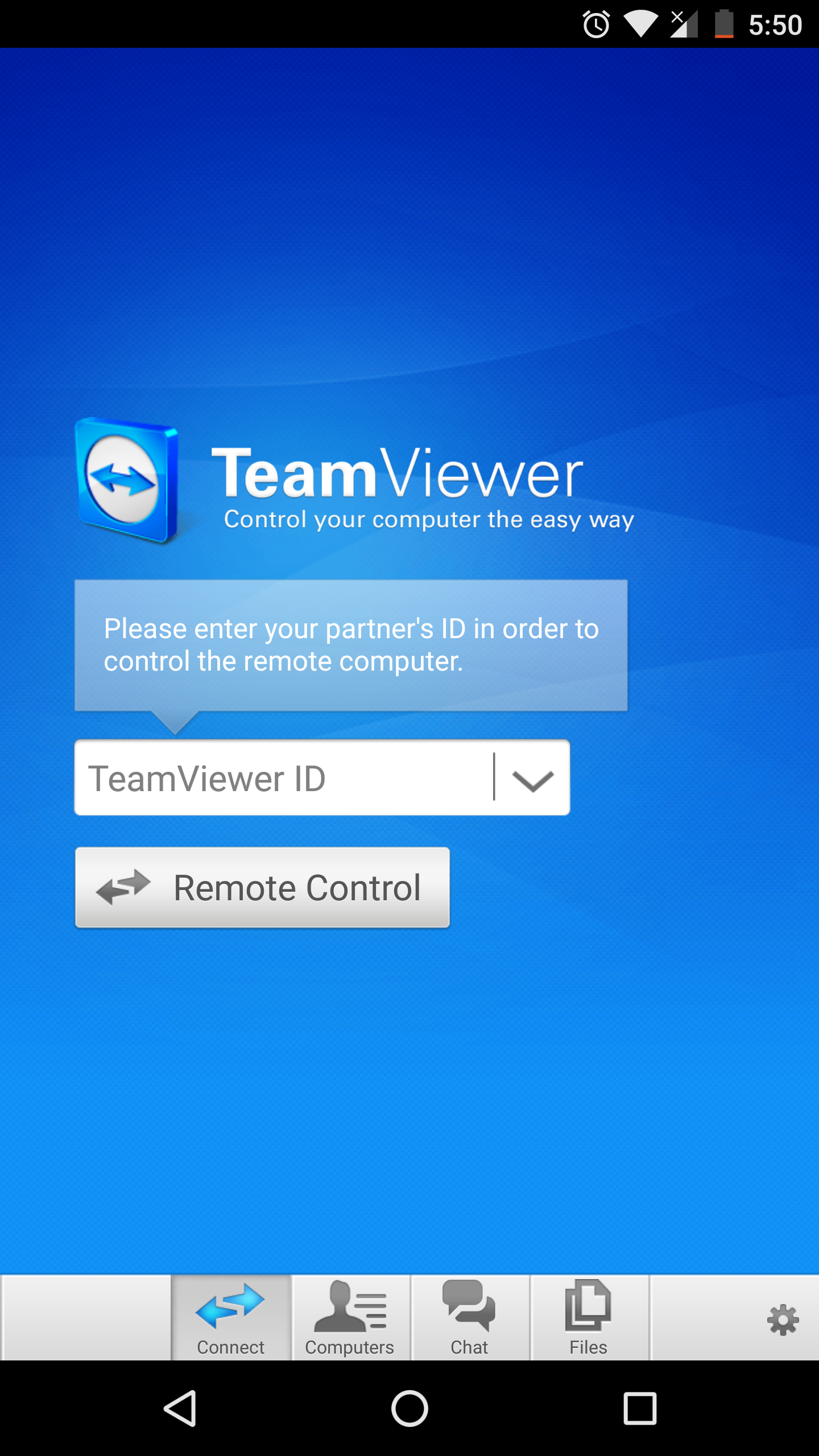
Current Version - The current version of the app at the time of the redesign.
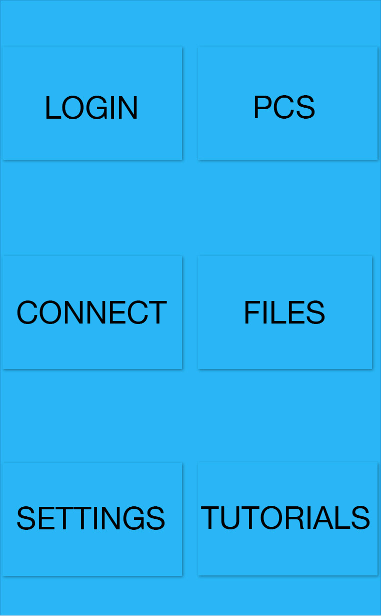
Basic layout - An incredibly basic screen of the grid layout that I will be using in my redesign.
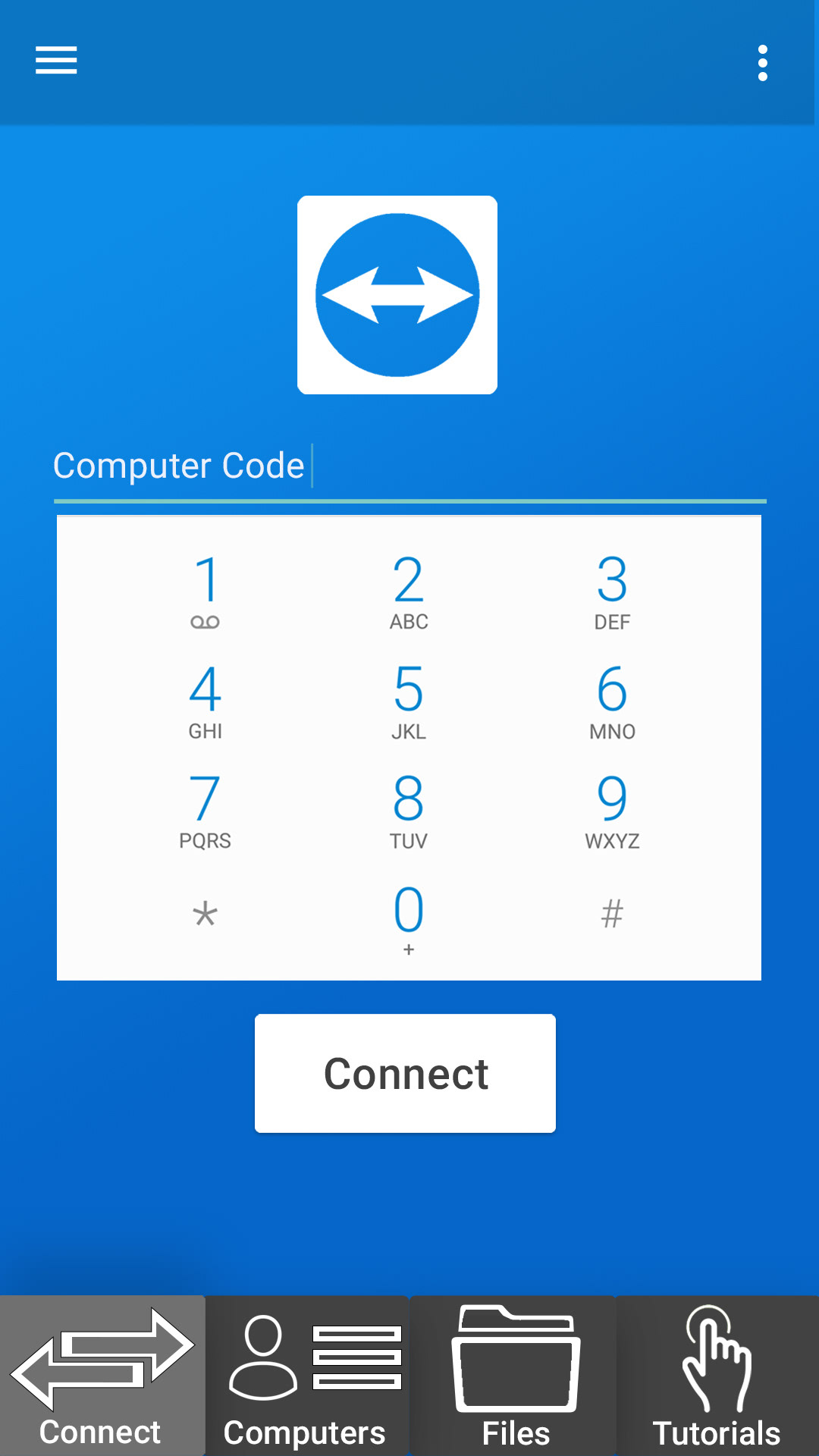
Redesign attempt 1 - This is the first prototype of my redesign, organising and removing unnecessary steps.
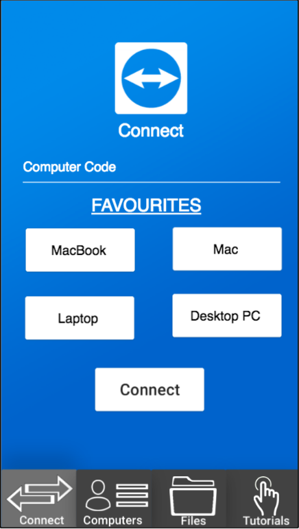
Redesign attempt 2 - This is an almost finished design, removing more unnecessary steps, including the keypad that has been reduced to an input field and adding the favourites section.
Final design - This is the final design of the TeamViewer app redesign, improving the general usability and removing unnecessary steps.

Design Problems
The general design problem that I had was that when I was looking into the general usability problem was that the number of steps taken throughout the app was so much more than was needed. This involved laying out the current app layout and seeing where the logic for the application can be improved.
This restricted my designs slightly but as I was wanting to improve on features and accessibility this wasn’t a problem until it came to the layout which was then solved due to my rapid prototyping and inspiration.
Final Designs
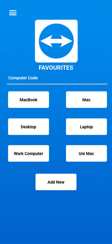
Favourites (Connect simplified) - Connect page has been removed due to increased amount of steps.
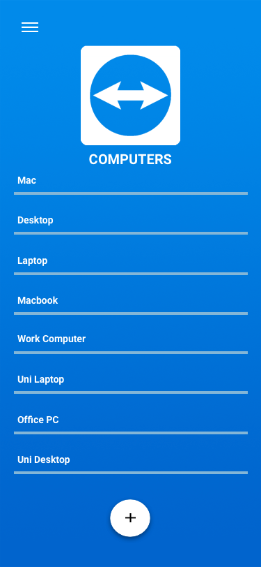
Computers - Open connection to other computers.
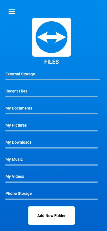
Files - Open the files that the user will have downloaded while using the app.
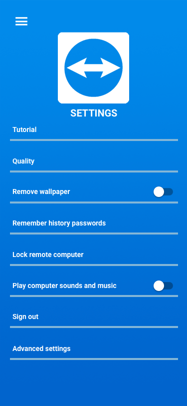
Settings - Tutorial moved to main nav bar for accessibility.